15 Best Free Fonts of 2025 You Can't Miss for Stunning Designs
Introduction
Free fonts have transformed the design landscape dramatically. What was once a compromise between budget and quality has become a legitimate pathway to professional typography. Foundries now release impressive typefaces under free licenses, challenging assumptions about what complimentary means. The best free fonts available in 2026 rival premium offerings in both quality and versatility.
Typography remains foundational to effective design. Font choice establishes mood, communicates hierarchy, and guides reader attention. Whether designing websites, crafting branding materials, or producing print collateral, the right typeface elevates work significantly. These free options provide professional foundations without licensing concerns.
This guide presents fifteen essential free fonts for 2026. Each typeface offers distinct character and practical application. Some excel at headlines, others at body text, and many provide versatile systems for comprehensive design projects. The collection spans styles from sleek modern sans-serifs to distinctive display faces.
Understanding font licensing matters even with free typefaces. Most free fonts permit personal and commercial use, but review specific licenses before redistribution or modification. Foundries deserve acknowledgment when possible—they make quality typography accessible to everyone.
Why Free Fonts Matter in 2026
The evolution of free fonts reflects broader changes in creative industry economics. Designers increasingly work across projects with varying budgets. Free fonts provide professional options for pro bono work, personal projects, and client projects with limited font budgets. This accessibility democratizes design quality across the industry.
Quality foundries releasing free fonts build audiences and reputations. Many designers discover foundries through free offerings and subsequently purchase premium releases. This model benefits everyone—designers access quality typography, foundries build markets. The ecosystem continues strengthening as a result.
Technology enables this transformation. Distribution through websites makes discovery easy. Variable font technology enables single-file fonts with unprecedented flexibility. Web font delivery removes installation barriers. These advances make free fonts more practical than ever.
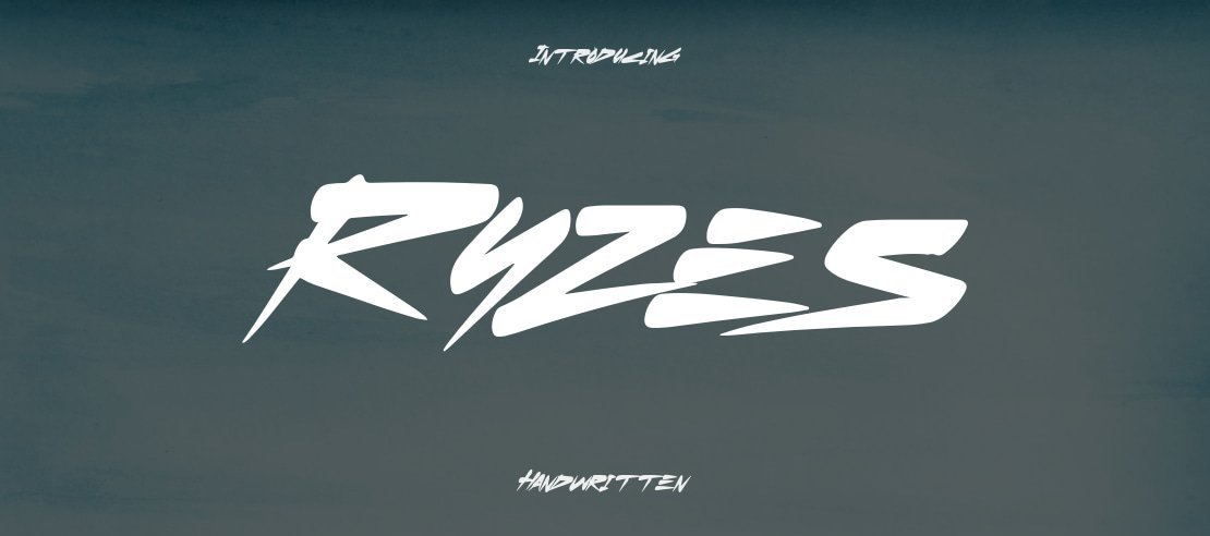
Ryzes Font
Ryzes Font exemplifies modern typography done correctly. Clean lines intersect with contemporary aesthetic creating versatile letterforms. The design balances geometric precision with subtle personality, working equally well in digital interfaces and print applications. Both headline and body text benefit from carefully considered x-height and proportion.
Designers value Ryzes for its adaptability. Tech companies appreciate the contemporary sensibility. Lifestyle brands find approachable sophistication. Minimalist projects gain structure without coldness. The typeface provides solid foundation accommodating various design directions without competing for attention.
Practical applications span diverse contexts. Website headers gain immediate professionalism. Print collateral achieves refined appearance. Brand identity systems benefit from consistent typographic voice. Ryzes delivers reliable performance across applications, making it valuable addition to any font library.
The Destiny Font
The Destiny Font merges elegance with creative expression. Distinctive letterforms feature flowing curves and refined details adding sophistication to any project. The design excels in contexts requiring personality beyond generic typography—wedding invitations, luxury branding, editorial layouts.
The typeface balances classic inspiration with contemporary sensibility. This dual nature allows successful application in traditional and modern contexts. Projects needing personality without sacrificing professionalism benefit substantially. The font communicates considered design judgment immediately apparent to viewers.
Branding projects particularly benefit from The Destiny's distinctive character. Product packaging gains premium perception. Service businesses communicate refined capability. Editorial content achieves sophisticated presentation without premium font investment.
Aldo Sans
Aldo Sans delivers modern condensed typography for professional applications. The font family offers multiple weights, providing flexibility across design needs. Sleek, professional appearance suits corporate communications, tech companies, and minimalist brands seeking contemporary refinement.
Condensed structure maximizes impact within limited horizontal space. Headers achieve strong presence without excessive width. Navigation elements gain clarity without overwhelming surrounding content. Editorial layouts accomplish density while maintaining readability.
Professional projects requiring sophisticated simplicity find Aldo Sans invaluable. The typeface communicates competence and contemporary sensibility. Brands seeking modern refinement without trendy novelty achieve appropriate typographic voice. The font performs consistently across applications, from corporate presentations to digital interfaces.
Vigosamine Font
Vigosamine Font commands attention through bold, impactful design. Thick strokes and geometric shapes create immediate visual presence. Headlines become focal points. Logos gain instant recognition. Branding materials communicate confidence and authority.
Despite bold appearance, Vigosamine maintains remarkable readability. Letterforms remain clear across various sizes. This balance between impact and function expands practical applications significantly. The font succeeds in posters, packaging, web headers, and signage alike.
Projects requiring authoritative presence benefit substantially from Vigosamine. The typeface communicates strength and confidence. Brands seeking to project stability and leadership find appropriate typographic voice. The design succeeds in both digital and print contexts.
Ocean Free
Ocean Free provides bold, modern display typography through all-caps letterforms. Geometric construction creates contemporary aesthetic suitable for impact-focused projects. Headlines become visually commanding. Brand statements demand immediate attention.
The design works exceptionally well in minimalist contexts. Clean letterforms stand effectively against simple backgrounds. Modern appearance aligns with contemporary brand identities. Tech, fashion, and lifestyle sectors particularly benefit from Ocean Free's sensibility.
Versatility within its style category makes Ocean Free valuable. The font adapts successfully to bold graphic design and refined editorial applications. Projects needing modern display typography without historical reference points achieve goals effectively. The typeface provides reliable performance across use cases.
Nanotech
Nanotech offers clean, futuristic sans-serif typography perfect for technology-adjacent projects. Geometric precision communicates innovation and modernity. Tech startups, software companies, and digital products benefit significantly from this aesthetic alignment.
Minimalist structure supports extended reading comfortably. Body text flows naturally across long-form content. Interface applications achieve clear information hierarchy. Technical documentation maintains readability without sacrificing visual appeal.
Brands wanting technological sophistication find Nanotech appropriate. The typeface bridges humanist warmth and technical precision successfully. Projects requiring credibility in technology contexts benefit from this careful balance. The design communicates expertise without appearing inaccessible.
Beckan
Beckan combines style and versatility for broad design applications. The typeface works across personal and commercial projects without licensing concerns. Unique design elements provide character while maintaining professional appearance.
The font adapts successfully to various contexts. Packaging gains distinctive shelf presence. Editorial layouts achieve contemporary sophistication. Branding projects communicate creative capability. Social media content stands out in crowded feeds.
Commercial designers particularly appreciate Beckan's flexibility. The typeface accommodates diverse client needs without licensing complexity. Projects spanning multiple applications maintain typographic consistency through Beckan's adaptable design. The font provides reliable performance across use cases.
Sagitarion Font
Sagitarion Font brings futuristic display typography for creative projects. Sharp, angular letterforms communicate innovation and forward-thinking sensibility. Projects aiming for cutting-edge appearance achieve immediate visual distinction.
The font works exceptionally well in entertainment contexts. Gaming projects gain immersive atmosphere. Sci-fi branding communicates genre expectations. Event marketing creates anticipation through contemporary aesthetic.
Bold design requires confident application. Sagitarion performs best where it can dominate typographic hierarchy. Smaller sizes diminish distinctive qualities. Used appropriately, the font creates memorable impressions that endure.
Aesthico
Aesthico delivers aesthetic, modern typography for contemporary design needs. The typeface suits branding, social media, and editorial applications where current sensibility matters. Clean letterforms communicate sophistication without appearing cold.
The font works particularly well in lifestyle contexts. Fashion branding gains contemporary edge. Beauty products achieve refined presentation. Food and hospitality communicate modern appreciation. The typeface bridges premium aspiration and accessible execution.
Designers appreciate Aesthico's current relevance. The font doesn't rely on retro nostalgia or futuristic novelty. Instead, it represents present-moment aesthetics communicating contemporary awareness. The design succeeds in projects requiring up-to-date appearance.
Monday Vacation
Monday Vacation brings playful, distinctive typography for creative projects. The font's quirky personality adds immediate character to designs lacking visual interest. Invitations, greeting cards, and social content gain distinctive voice.
The design balances whimsy with functionality. Letterforms remain readable despite playful construction. Headlines communicate lighthearted approach. Body text accommodates casual content. This versatility expands practical applications beyond pure decoration.
Projects needing personality beyond generic typography benefit substantially. Children's content gains appropriate youthful tone. Creative agencies communicate innovative capability. Lifestyle brands wanting approachable sophistication find Monday Vacation communicates desired positioning effectively.
Attika
Attika provides variable font technology enabling flexible typographic systems. Single font file adjusts weight, width, and other attributes dynamically. This capability simplifies font management while expanding design possibilities considerably.
Variable font technology benefits responsive design particularly well. Typography adapts smoothly across viewport sizes. Animation possibilities expand through smooth weight transitions. Design systems gain consistency through unified font resource.
Modern web projects benefit substantially from Attika's approach. The typeface supports sophisticated typographic treatment without multiple font file loads. Performance and flexibility combine through variable font technology, making Attika particularly valuable for contemporary web design.
Lil Stuart Font
Lil Stuart Font adds quirky, distinctive personality to typography collections. The typeface brings unique character for projects wanting visual distinction. Packaging gains shelf presence. Branding becomes memorable. Content communicates creative confidence.
The design works best where personality matters more than traditional refinement. Creative industries find appropriate voice. Youth-oriented brands achieve demographic alignment. Projects wanting to stand apart from corporate generic typography benefit from Lil Stuart's distinctive approach.
Designers appreciate the font's genuine uniqueness. Unlike fonts modifying existing styles slightly, Lil Stuart offers recognizable character. This authenticity translates to designs feeling considered rather than generic.
Chicago Shift Font
Chicago Shift Font channels retro aesthetic for contemporary applications. The design evokes mid-century typography while maintaining current usability. Vintage-inspired projects gain authentic period feel. Modern designs achieve distinctive personality.
The font suits brands wanting to communicate heritage or craftsmanship. Restaurants gain nostalgic warmth. Artisan products communicate handmade quality. Vintage-style marketing achieves appropriate visual language without strained imitation.
Designers should apply Chicago Shift deliberately. Strong retro personality dominates designs. Subtle applications work better than heavy-handed treatment. Used thoughtfully, the font creates memorable impressions balancing past and present effectively.
Sugardays Font
Sugardays Font brings sweet, charming typography for elegant applications. Delicate letterforms communicate femininity and sophistication. Wedding work gains refined beauty. Beauty branding achieves appropriate luxury. Lifestyle content communicates graceful appreciation.
The design balances elegance with readability. Headlines communicate gentle personality. Body text remains comfortable at smaller sizes. This versatility expands applications beyond pure display usage.
Projects needing sophisticated feminine typography find Sugardays valuable. The font communicates without overwhelming. Refined aesthetic suits premium positioning. The typeface bridges commercial viability and distinctive character effectively.
Conclusion
Free fonts in 2026 offer remarkable quality and variety. These fifteen typefaces provide starting points for virtually any design project. From sleek modern sans-serifs to distinctive display faces, the collection covers diverse typographic needs.
Professional design doesn't require expensive font purchases. These resources provide legitimate alternatives to premium typefaces. Foundries generously sharing their work deserve support through acknowledgment and continued usage. Their contribution democratizes quality typography for designers everywhere.
Explore these fonts experimentally. Test applications beyond obvious uses. Combine typefaces thoughtfully. The right font transforms design from adequate to exceptional. These free options make that transformation accessible to designers at every level.
Building a font library takes time and consideration. Start with versatile options like Ryzes or Aldo Sans. Add distinctive faces like Vigosamine or Sagitarion for specific projects. Let these free resources expand your typographic vocabulary without expanding your budget.