
Design tips
Is Motion Design Still Worth Learning in 2026?
If you are asking, “is motion design still worth learning 2026?”, the honest answer is not a simple yes or no. AI can now generate convincing movement, junior roles are
Unlock the secrets to successful design with our design tips. Discover expert advice, practical techniques, and invaluable insights to enhance your design skills. From industry trends to productivity hacks, our curated tips will empower you to create exceptional designs. Level up your creativity and stay ahead of the game.
If you are asking, “is motion design still worth learning 2026?”, the honest answer is not a simple yes or no. AI can now generate convincing movement, junior roles are
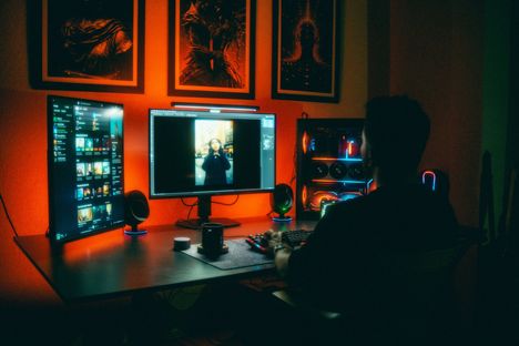
You can spot it in three seconds. Same confident sans serif, same purple blue gradient wash, same card grid with the same rounded corners and the same soft shadow. The
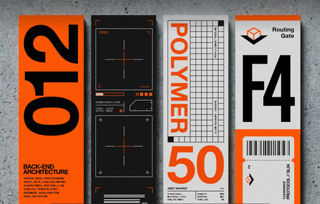
You opened Illustrator. You set up a 12-column grid. You reached for Helvetica. Three hours later, you have something technically correct and completely lifeless — and you are wondering why
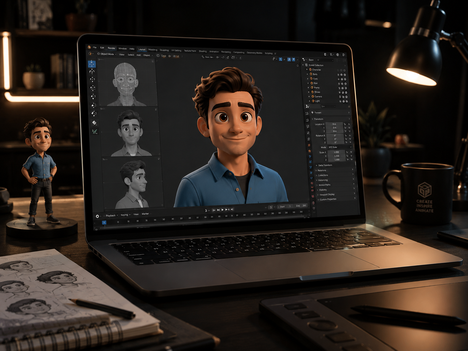
Ask any motion designer about their biggest project nightmare, and they will not complain about complex After Effects expressions, 3D render farm bottlenecks, or tight delivery deadlines. They will tell

I watched a first-time author spend $8,000 on gorgeous watercolor illustrations for a board book aimed at toddlers. The art was stunning — delicate, layered, full of subtle color gradients.
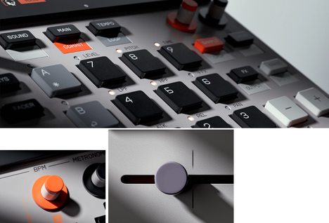
The fastest way to feel lost in motion design is to open After Effects, search for a glowing title tutorial, and try to reverse-engineer taste from keyframes. You may finish

Every time a client asks me to "make this spreadsheet look good," I feel the same small hesitation. Not because I don't want the work — I love it. But

Maximalism looks easy until you try to make it work. You add a paper grain, then a floral pattern, then a second pattern, then a distressed type treatment, and suddenly