High-Contrast Serifs: When Sharp Contrast Works and When It Fails
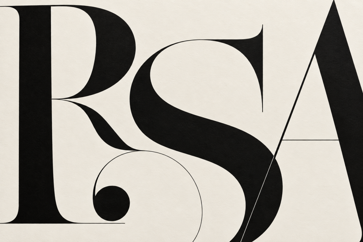
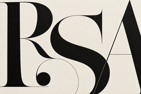
High-contrast serifs work best when their thin strokes remain visible and their strong shapes suit the job. A short editorial headline can give them room to shine. A small label over a busy photograph can expose every weakness. The decision depends on the actual font, its optical size, and the finished output, rather than a rule that all Bodonis belong above a certain pixel size.
Start by separating three decisions: the mood you want, the amount of text people need to read, and the conditions in which they'll read it. Then test the specific typeface in that setting. A family name tells you something about its design; it doesn't guarantee how a particular cut will perform.
Key Takeaways
Didones such as Bodoni and Didot are familiar examples of high stroke contrast.
Clarendon belongs to the slab-serif tradition, making it a useful comparison rather than a second high-contrast subfamily.
Text cuts and optical sizing can make a Didone more suitable for smaller type; display cuts need separate testing.
Stroke contrast and foreground/background contrast describe different things. Check both.
Proof the smallest real use, including mobile headings, packaging details, and reduced-size brand assets.
What makes a serif high contrast?
Stroke contrast is the difference between the thick and thin parts of a letter. In a high-contrast serif, that difference becomes a prominent part of the design. Look at a capital O, an H, and a lowercase n: the heavy strokes and finer connections create a distinct pattern within each word.
There isn't a useful universal ratio that settles whether a font belongs in this category. Comparing a hairline and a stem can help you describe a specimen, but a measurement taken from one letter won't tell you how an entire alphabet reads. Weight, proportions, spacing, and the size of the counters also matter.
Didone is a more specific classification. It describes a recognizable combination of pronounced stroke contrast, vertical stress, and thin, typically unbracketed serifs. Bodoni and Didot are common examples. Monotype's typography style guide distinguishes these designs from transitional faces such as Baskerville and slab serifs such as Clarendon.
Bracketing describes the curved connection between a serif and the main stroke. It doesn't measure contrast. A bracketed serif can still show substantial thick-to-thin variation, while an unbracketed slab can have relatively even strokes.
For a wider view of the categories, see our guide to types of fonts and how to use them. Use classification to narrow the search, then judge the font in your own layout.
Didone, transitional, and Clarendon: a useful comparison
These groups offer different starting points, not interchangeable versions of the same design.
Category | Typical features | Familiar examples | What to inspect |
|---|---|---|---|
Didone | Strong stroke contrast, vertical stress, fine serifs | Bodoni, Didot | Hairlines and the suitability of the chosen cut |
Transitional | Increased contrast compared with many old-style designs, refined serifs | Baskerville | Paragraph texture, spacing, and small-size performance |
Clarendon-style slab | Substantial bracketed serifs, generally lower contrast than Didones | Clarendon | Density, counters, and width in bold settings |
The practical distinction is clearer in a specimen than in a label. Compare the same headline in each candidate at the same intended size. A larger x-height or wider letter can make one look more prominent even when the nominal point size matches.
Don't assume that a heavier serif is automatically more readable. A bold, condensed headline can become crowded, particularly in a narrow column. Inspect letter separation and internal spaces as carefully as the thin strokes.
Where high-contrast serifs work well
Editorial headlines and short statements
A title, opening phrase, or pull quote gives a high-contrast serif enough space to establish its character. The surrounding layout can remain restrained: a clear grid, limited colors, and supporting text that doesn't compete for attention.
Try the actual headline rather than a specimen word. “Style” and “International Architecture Review” create different spacing and wrapping problems. Check capitals, punctuation, numerals, and italics if they're part of the design.
Use line breaks intentionally. A balanced two-line title is often easier to place than a long line reduced until it fits. The type choice should support the hierarchy, which our poster typography hierarchy guide explores in more detail.
Brand names and logos
A high-contrast wordmark can suit a brand that wants an editorial tone. Judge the feeling against the client's audience and other visual assets instead of assuming the font will make any business feel luxurious.
Proof the exact name at every required size. Look closely at tight letter pairs and delicate terminals. A wordmark that looks balanced across a presentation slide may need adjustments for a small label, browser header, or profile image.
Plan any small-use variation as part of the identity. That could mean an approved monogram, adjusted spacing, or a sturdier related drawing. Keep those variants documented so future designers don't improvise a different logo every time space becomes tight.
Posters, invitations, and packaging
Short text and controlled composition make these useful settings for expressive serifs. You can position the type away from photographic detail and leave enough room around it for the shapes to remain distinct.
The production method still matters. Request a proof on the intended stock or material, especially if the design uses fine lettering, reversed text, foil, or embossing. Ask the supplier about minimum reproducible detail instead of borrowing a threshold from an unrelated printing process.
Where sharp contrast becomes a liability
Small text in a display cut
The risky combination is a fine display drawing used where small text has to carry essential information. Captions, navigation labels, product details, and legal copy deserve their own type decisions.
There is no dependable “fails below 18px” rule across all Didones and devices. A font's hairline thickness, optical size, rasterization, and background change the result. Test the smallest intended use directly. If strokes seem to disappear, try a text cut, another optical size, or a different family.
Increasing weight can help in some cases, but it changes more than the thin strokes. Counters can tighten and the word can become darker. Compare the revised setting in context rather than selecting bold as a universal fix.
Text over images and textured backgrounds
A headline can have enough contrast against one part of a photograph and disappear against another. Fine strokes make those changes particularly noticeable.
Give the text a stable surface: a solid panel, a carefully placed overlay, or an area of the image with little variation. Check the mobile crop too. A background that is quiet behind the desktop headline can become busy after the image shifts.
Avoid relying on a heavy shadow to rescue the setting. It can blur delicate details and change the character that made you choose the font.
Uncontrolled reductions and exports
An image that looks clean in a full-size design file can look different after resizing or compression. Inspect the exported asset at its actual display size, including the thumbnail or feed preview if that is how people encounter it.
Keep live text where the format allows it. When text must be part of a raster image, compare the final downloaded version rather than only the source canvas. If essential details become hard to read, simplify the design or choose a sturdier setting before export.
Optical sizing changes the choice
Optical size is a design adjustment for the size at which a typeface will be used. A text-oriented drawing can differ from a display drawing in its stroke proportions, spacing, and detail. Enlarging the same outline isn't always enough.
The Bodoni* project, for example, provides multiple optical sizes to address the different demands of small and large settings. This is why the advice to treat every Bodoni as display-only is too broad.
Monotype also describes a text-oriented Didot option in its Helvetica serif pairing collection. The relevant choice is the specific cut and use, not simply the historical name on the menu.
In a variable font, an opsz axis can provide optical-size adjustments. The font must actually contain that axis; browser CSS can't create missing drawings. MDN's optical-sizing reference explains how font-optical-sizing uses it.
.editorial-title {
  font-family: "Your Licensed Serif", Georgia, serif;
  font-optical-sizing: auto;
  font-size: clamp(2rem, 4vw, 4.5rem);
  line-height: 1.1;
}
This is an example rule, not a complete font installation or a guarantee of readability. Load your licensed font through the project's existing method and confirm which file reaches the browser. If the family uses separate Text and Display files, select the appropriate one explicitly.
Check optical sizing in the finished page. Font subsets, build tools, and manually set variation values can complicate the result. Compare the available settings rather than assuming the font name proves the correct drawing loaded.
Pair high-contrast serifs by role
Give each typeface a clear job. An expressive title can sit above quieter body text and straightforward interface labels. That arrangement makes the display face easier to appreciate without asking it to handle every reading task.
Start with a complete layout: title, standfirst, paragraph, caption, and button or label if needed. Compare the visual size, spacing, and weight of the two families. A pairing can look balanced in two isolated specimen lines and awkward once paragraphs enter the page.
Role | Starting approach | Check before approving |
|---|---|---|
Main headline | Expressive high-contrast cut | Wrapping and thin-stroke visibility |
Body copy | A text-oriented serif or sans | Comfortable reading in real paragraphs |
Captions and labels | A cut tested at small sizes | Punctuation, numerals, and available width |
Wordmark | Customized setting of the chosen face | Small-use version and production proof |
A Didone headline with a text-oriented serif is one option; a simple sans is another. Avoid choosing the companion solely because a font-pairing list recommends it. Use our font pairing tools guide to explore candidates, then compare them with your content.
Be conservative with tracking in paragraphs. Large letter-spacing changes can disrupt the word shapes and texture of body copy. For short display text, small adjustments may improve a particular setting, but review both the spacing within pairs and the rhythm across the whole line.
Screen accessibility requires a separate check
Stroke contrast is internal to the letter. Color contrast is the difference between the text and its background. Passing one test doesn't settle the other.
The W3C explanation of minimum contrast sets a 4.5:1 minimum for ordinary text and 3:1 for qualifying large text, with defined exceptions. Thin strokes can still look weak in practice even when the specified colors meet the ratio. Check the rendered type as well as the color values.
Test enlargement, narrow viewports, and user spacing adjustments. Headlines should be able to wrap without hiding words or overlapping nearby controls. The W3C text-spacing guidance addresses preserving content and functionality when users override specified spacing properties.
Keep important text selectable and available to assistive technology rather than turning ordinary headings into images. For an actual logo image, provide appropriate alternative text according to its use. The supporting page still needs readable headings and body copy.
A proofing workflow for the actual project
Build a specimen from the content you'll publish. Include a long headline, a short heading, two paragraphs, a caption, prices or dates, and accented characters if the project uses them. This reveals more than a perfect alphabet sample.
Identify the smallest use. Write down where the type will appear, including secondary assets and mobile layouts.
Check the available cuts. Confirm weights, italics, optical sizes, character coverage, and the permitted uses in the license.
Set the real content. Review awkward pairs, punctuation, numerals, and line breaks.
Inspect the output. Open the page on representative devices or request a physical production proof.
Try the difficult background. Check photos, dark panels, and reversed text if the design includes them.
Test adaptations. Enlarge web text, narrow the viewport, and inspect any reduced-size exports.
Record the decision. Document the chosen file, weight, optical size, spacing, and any approved small-use alternative.
This process also helps diagnose failures. If only a caption looks weak, fix that caption's setting. If every size looks wrong, reconsider the family or its role in the design. Our guide to common typography mistakes covers broader layout problems that a font change alone won't solve.
Common questions about high-contrast serifs
Can a high-contrast serif be used for body text?
Yes, when the specific design and cut support it. Test a text-oriented version or a suitable optical size in a full paragraph. A display specimen doesn't establish that the same file will work for sustained reading.
Is Clarendon a high-contrast serif?
Clarendon is generally classified as a bracketed slab serif. Its substantial serifs make it a useful alternative when you want a different texture, but it shouldn't be presented as the other half of the Didone category.
Does increasing the font size solve the problem?
It can improve visibility, but it doesn't fix a busy background, poor spacing, or an unsuitable production method. Check the finished use after changing the size.
Should every brand asset use the same serif?
A consistent identity can assign different fonts or cuts to different roles. Document those choices so an expressive wordmark, readable paragraph, and compact label feel like parts of the same system.
Choose the serif with the finished piece in front of you. If the hairlines remain clear, the words read comfortably, and the tone fits the project, the contrast is doing useful work. If it needs repeated rescue at smaller sizes, change the cut or reserve it for the places where it holds up.
Linh Nguyen
Graphic Designer
Passionate Graphic Designer | Specializing in Illustration Design | Bringing Captivating Visuals to Life