Free Handwriting Fonts for Restaurant Menus
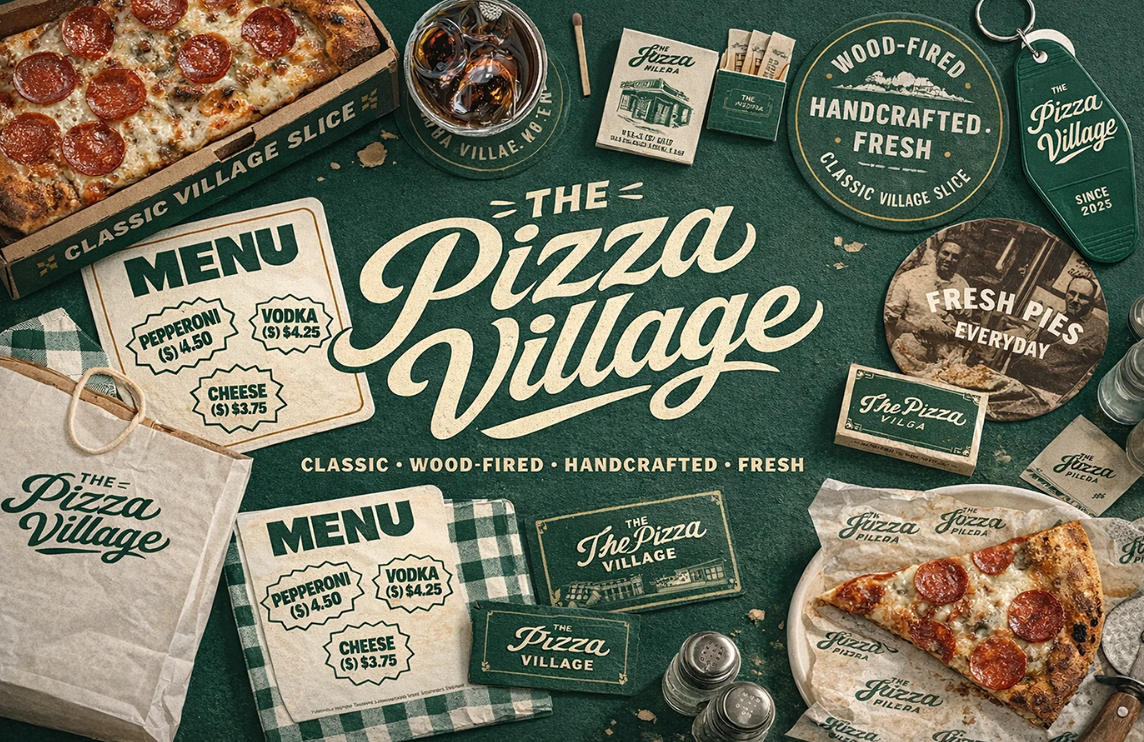
A handwriting font can make a restaurant menu feel warm before anyone reads the first dish. It can suggest a baker's hand, a chef's note, a chalkboard special, or the casual confidence of a neighborhood cafe. It can also make guests squint.
That is the line this guide cares about. The best free handwriting fonts for restaurant menus are not the fanciest scripts in the Google Fonts library. They are the ones that add appetite and personality in the right places, then step aside so the menu can do its real job: help people order with confidence.
Below is a practical 2026 shortlist of free Google Fonts, organized by restaurant concept, with pairing rules, print and QR-menu checks, and a few firm limits. Use the handwriting font for mood. Use a readable workhorse font for the meal.
The Rule: Handwriting Fonts Sell the Mood, Not the Whole Menu
Handwriting fonts are excellent at atmosphere. They feel personal, informal, crafted, nostalgic, playful, or intimate. On a restaurant menu, that makes them useful for the restaurant name, category headers, chef notes, seasonal specials, dessert callouts, and small decorative phrases.
They are weak at dense information. Dish descriptions, prices, allergens, modifiers, set-menu details, and QR-menu body text need to be read quickly. Guests are often reading in warm low light, from across a table, with reflections on laminated paper, or on a phone screen while trying to decide between three things.
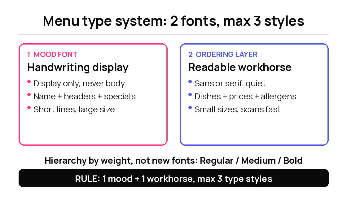
That is why the most reliable menu system uses two roles:
A personality font for the brand layer: name, headers, specials, small moments.
A workhorse font for the ordering layer: dish names, descriptions, prices, dietary labels.
Google Fonts makes this easy because the catalog is free, open source, and broad enough to build a complete system. The Google Fonts developer documentation confirms the fonts can be used in commercial and non-commercial projects, and the live Google Fonts catalog lets you check each family before you ship.
Think of the handwriting font like the host greeting a guest at the door. It sets the feeling. It should not also recite the entire wine list.
What Restaurant Menus Need From a Handwriting Font in 2026
Restaurant menus now live in more places than one printed page. A font may appear on a dine-in menu, QR menu, website, Instagram story, delivery insert, takeaway bag, chalkboard sign, and digital menu board. A handwriting font that looks beautiful in a static mockup may fail in half of those settings.
Before choosing one, test it against five practical questions.
First, can guests read it at real size? A script that works at 48px may fall apart at 18px. For digital menus, keep functional text in readable sans or serif fonts. For print, test the menu at table distance and in the restaurant's actual lighting.
Second, does it match the food? A loose chalkboard font can feel right for a bakery, brunch spot, or coffee shop. The same font may make a fine-dining tasting menu feel less precise. Typography sets expectation before the plate arrives.
Third, does it handle prices and numbers? Many handwriting fonts have charming letters but awkward numerals. If the 8, 3, or currency symbol feels unclear, keep numbers in the body font.
Fourth, does it support the language you need? This matters for restaurants using Vietnamese, Thai, Spanish, French, or names with accented characters. Always check the specimen page for language support.
Fifth, can it be implemented responsibly? If the menu is on a website or QR ordering page, consider loading only the weights you use, using good contrast, and self-hosting when privacy or compliance matters.
Once the font passes those checks, choosing becomes much easier.
Best Free Handwriting Fonts for Restaurant Menus by Concept
These fonts are all available through Google Fonts. Use them as accents first, then pair them with a clear body font.
1. Delicious Handrawn for bakeries, cafes, and handmade food
Delicious Handrawn has the right kind of imperfection for casual food branding. It feels handmade without becoming too delicate, which makes it a natural fit for bakeries, breakfast menus, sandwich boards, and small-batch food labels.
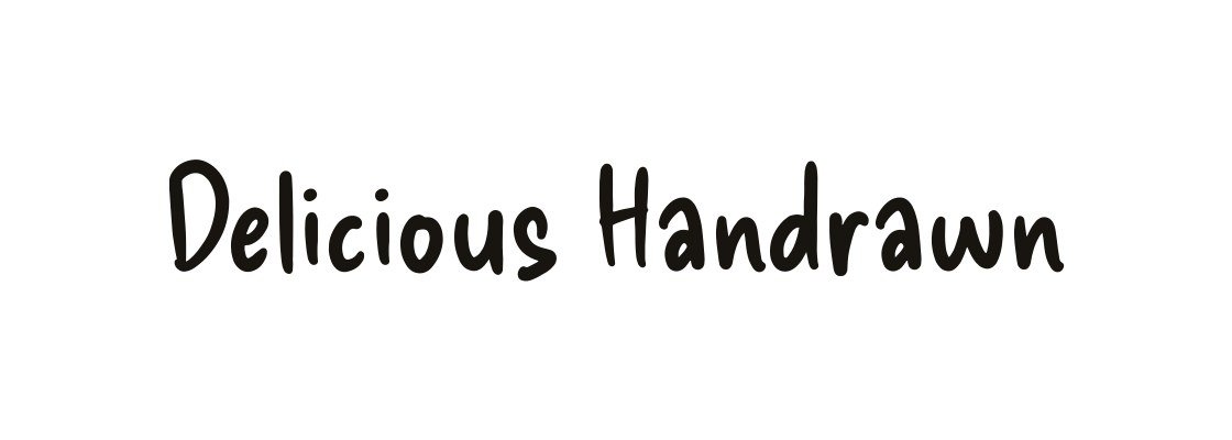
Use it for section headers like "Fresh Today," "From the Oven," or "House Specials." It can also work for a cafe logo if the rest of the menu stays clean.
Do not use it for every item name. Its charm comes from contrast. Let a readable sans handle croissants, prices, ingredients, and pickup details.
2. Sriracha for Thai restaurants, noodle shops, and casual Asian menus
Sriracha has an informal loopless handwriting style. It feels casual, flavorful, and friendly without relying on generic "Asian restaurant" visual cliches.
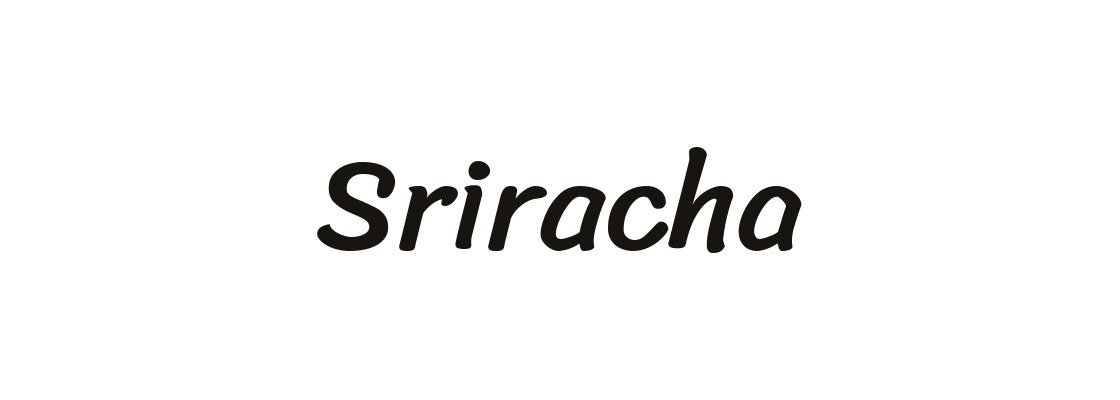
Use it for Thai restaurants, noodle shops, street-food concepts, casual lunch menus, and spicy specials. It can give a menu warmth while still feeling more structured than a swashy script.
For Latin dish descriptions, try Noto Sans, Open Sans, or Lato. For Thai text, select a Thai-supporting family and test the actual words.
3. Smooch for cocktail specials, desserts, and energetic headers
Smooch is brushy, fast, and full of personality. It has the energy of quick hand lettering, which makes it useful for cocktail lists, dessert features, brunch specials, and social menu graphics.

Use it when the menu needs movement: "Weekend Brunch," "Happy Hour," "House Cocktails," or "Sweet Things." It can make a small section feel alive.
Keep it large. Brush scripts lose clarity quickly when they are squeezed into small sizes, especially on glossy menus or phone screens.
4. Merienda for bistros, brunch menus, and warm section titles
Merienda is a good middle ground. It has a brush-like rhythm, but it is more controlled than many handwriting fonts. That makes it useful for restaurants that want warmth without looking too casual.
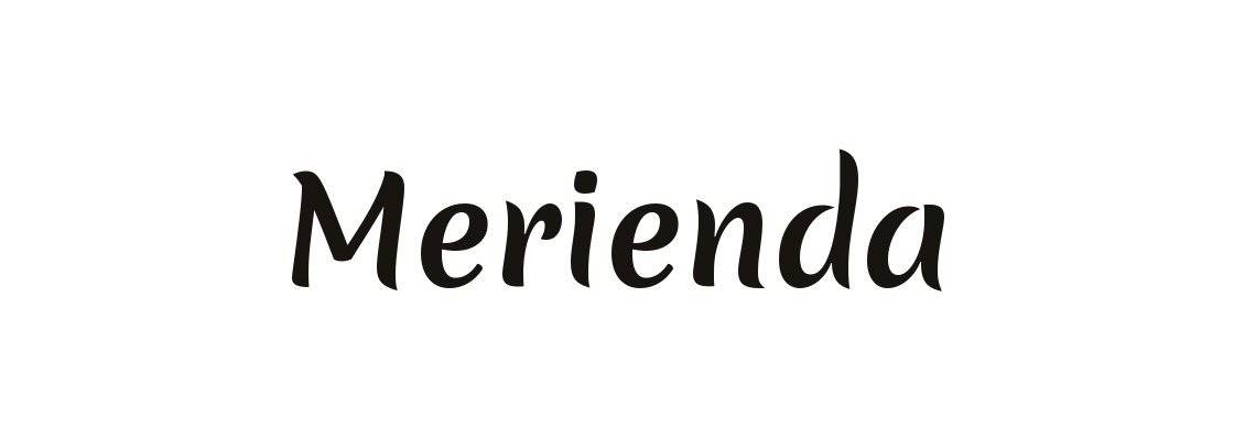
Use it for bistro menus, brunch sections, cafe headers, and friendly family restaurants. It can also work well on a website hero where you want a little softness without a full script treatment.
Merienda is still a display choice. Use it for short lines, not ingredient paragraphs.
5. Caveat for chef notes, chalkboards, and annotation-style moments
Caveat is designed for handwritten notes and annotations, which makes it a natural fit for menus that need a human aside. It can feel like something a chef wrote in the margin.

Use it for "Ask about today's pie," "Made with local honey," "Chef's favorite," or chalkboard-style callouts. It works best when the content is short and conversational.
Avoid Caveat for polished fine-dining menus unless the concept has an intentionally relaxed edge.
6. Dancing Script for bakeries, dessert shops, and familiar cafe warmth
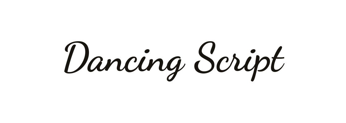
Its familiar script style may fit the concept, but test legibility at your actual display size with representative readers. If you use it, make the layout, color, photography, and pairing do more of the brand work.
Use Dancing Script when familiarity is helpful. Skip it when the restaurant needs a distinctive custom-feeling identity.
7. Homemade Apple for nostalgic recipe-card menus
Homemade Apple feels like a recipe card, which is perfect for certain restaurants and completely wrong for others.
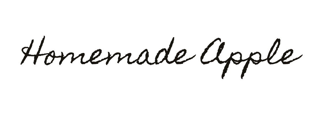
Use it for nostalgic bakeries, pie shops, homestyle kitchens, farmers market menus, and handwritten-note accents. It can make a short phrase feel personal and cared for.
Do not use it for anything guests must scan quickly. Test whether this cursive treatment slows readers at the intended size; a menu should not make ordering harder.
The shortlist is intentionally practical. A restaurant menu has to be beautiful, but it has to be useful first.
Pair Each Script With a Workhorse Font for Prices and Descriptions
A handwriting font needs a partner. The partner should be quieter, clearer, and better at small sizes.
For casual cafes and bakeries, pair Delicious Handrawn, Caveat, or Dancing Script with Open Sans, Lato, or Nunito. These fonts feel friendly and stay readable in item descriptions.
For bistros and softer restaurants, pair Merienda or Smooch with Source Sans 3 or Lora. This keeps the menu warm without letting it drift into novelty.
For Thai or multilingual menus, pair Sriracha with a script-specific family such as Noto Sans Thai and test it at menu size. The separate Noto Sans family covers Latin, Cyrillic, and Greek; it does not supply Thai glyphs. The goal is a consistent voice across scripts, not a decorative Latin font pasted beside a functional local-language font.
Keep the system tight:
One handwriting font for mood.
One readable font for the ordering layer.
Optional weight changes for hierarchy.
No more than three type styles across the full menu.
If the menu starts needing a fourth font, the layout probably needs more hierarchy, not more personality.
Print, QR, and Menu Board Rules: Size, Contrast, and Lighting
The real test of a restaurant font is not the design file. It is the table.
For printed menus, test at the size guests will actually hold. Look at it under the restaurant's dimmest lighting, not just at your desk. If the dish description feels cramped, increase size, line height, or contrast before changing the font again.
For QR menus, preview on a real phone. Script fonts should stay in headers or small callouts. Item names, descriptions, prices, allergens, and buttons need strong contrast and readable body type. For digital menus, try 16px or larger body text as a starting design choice, then test readability and resizing; this is not a universal accessibility minimum, with larger sizes when the environment is dark or the audience skews older.
For digital menu boards, be stricter. Decorative scripts often fail at distance. Use handwriting fonts for logo moments or large featured headers only, then switch to a clear sans for items and prices.
Also watch the background. A script over food photography can look lovely in a mockup and become unreadable in the restaurant. If you place text over an image, use a solid overlay, stronger contrast, or move the type away from busy texture.
Good menu typography feels generous. Guests should not have to earn the right to read dinner.
Quick Do-Not-Use Rules Before You Print or Publish
Before a handwriting font goes live, run this final check.
Do not use script fonts for prices. Prices should be quiet, clear, and easy to compare.
Do not use handwriting fonts for allergens or dietary labels. Safety information needs clarity before personality.
Do not set long descriptions in cursive. One line can feel charming. Four lines feel slow.
Do not use low-contrast pastel script on cream paper unless you have tested it in real lighting.
Do not judge a font only by the restaurant name. Test real dish names, repeated letters, numbers, accents, and the longest item on the menu.
Do not use a handwriting font just because it feels "artisanal." Match it to the cuisine, price point, service style, and room.
Free handwriting fonts for restaurant menus can look polished, current, and deeply personal in 2026. The trick is to give them the right job. Let the script welcome the guest, frame the sections, and add flavor. Let the readable font do the ordering work. That balance is where the menu starts feeling designed, not decorated.
Tags
Linh Nguyen
Graphic Designer
Passionate Graphic Designer | Specializing in Illustration Design | Bringing Captivating Visuals to Life