Typography Hierarchy Poster: A Practical Reading Path
You can choose a beautiful typeface, build a clever grid, and still end up with a poster that makes people work too hard. The problem is rarely that the headline is not large enough. It is that every element is asking for attention at the same time.
A strong typography hierarchy poster gives the eye a route: what to notice first, what to understand next, and where to find the details when interest is earned. Here is a practical way to build that route before style takes over.
💡 Quick rule: If someone sees the poster for three seconds, they should understand the main event, the central idea, and the action to take.
Why typography hierarchy posters succeed or fail in three seconds
Posters are read under imperfect conditions: across a room, while scrolling, on a cluttered noticeboard, or beside five other images. That means hierarchy is not a finishing touch. It is the delivery mechanism for the message.
Think of the design as a host introducing guests at a busy event. The host does not announce every person at the same volume. They establish the headline act, give the essential context, then make the practical details available to people who want them.
A useful poster usually has three reading levels:
Primary: the event, idea, or hook that earns attention.
Secondary: the key context—speaker, date, theme, venue, or offer.
Tertiary: the details that support action, such as a URL, sponsors, or fine print.
When these levels have the same visual energy, viewers cannot tell where to start. When the primary level is clear, even a dense poster feels calmer because the reader has permission to ignore the details until they need them.
That makes the first design decision surprisingly simple: define the message order before you choose the type.
Start with a message ladder, not a font menu
Before opening Illustrator, Figma, or InDesign, write every piece of copy in a plain list. Then rank it by consequence: what must a viewer remember, what should they understand, and what can wait.
For an exhibition poster, the ladder might be:
Exhibition name.
Date and location.
One-line reason to care.
Artists, partners, ticket information, and accessibility details.
This is not the final layout. It is a content decision that protects the layout from late-stage chaos. If a stakeholder adds another sponsor or a longer subtitle, you can decide where it belongs instead of making every line smaller.
Give each level a job:
Level | Reader question | Design response |
|---|---|---|
Primary | “What is this?” | Strongest scale, placement, or contrast. |
Secondary | “Why should I care?” | Clear supporting relationship to the primary message. |
Tertiary | “What do I do next?” | Smaller but readable, grouped near the action. |
The ladder also makes a hard truth visible: if six facts are all “most important,” the brief has not been edited yet. Design cannot create priority that the content owner refuses to set.
Once the message has a sequence, you can create contrast without relying on a single oversized headline.
Create contrast with scale, weight, placement, and space
Scale is powerful, but it is only one control. A hierarchy becomes more resilient when multiple signals agree: the primary message might be larger, bolder, placed higher, given more whitespace, or set in a more distinctive colour. The secondary message can then support it with a quieter combination of those same tools.
The useful question is not “How many font sizes should this poster have?” It is “What visual evidence tells the eye this information comes first?”
Try this sequence:
Establish one dominant text block.
Create a visible jump down to the second level.
Group related tertiary details tightly so they read as a unit rather than a competing headline.
Reduce variation that has no message purpose—random weights, colours, outlines, and alignment changes all spend attention.
Guidance on using text and colour for poster hierarchy is especially helpful here: colour can separate information levels, but it should reinforce the reading order rather than become a substitute for it.
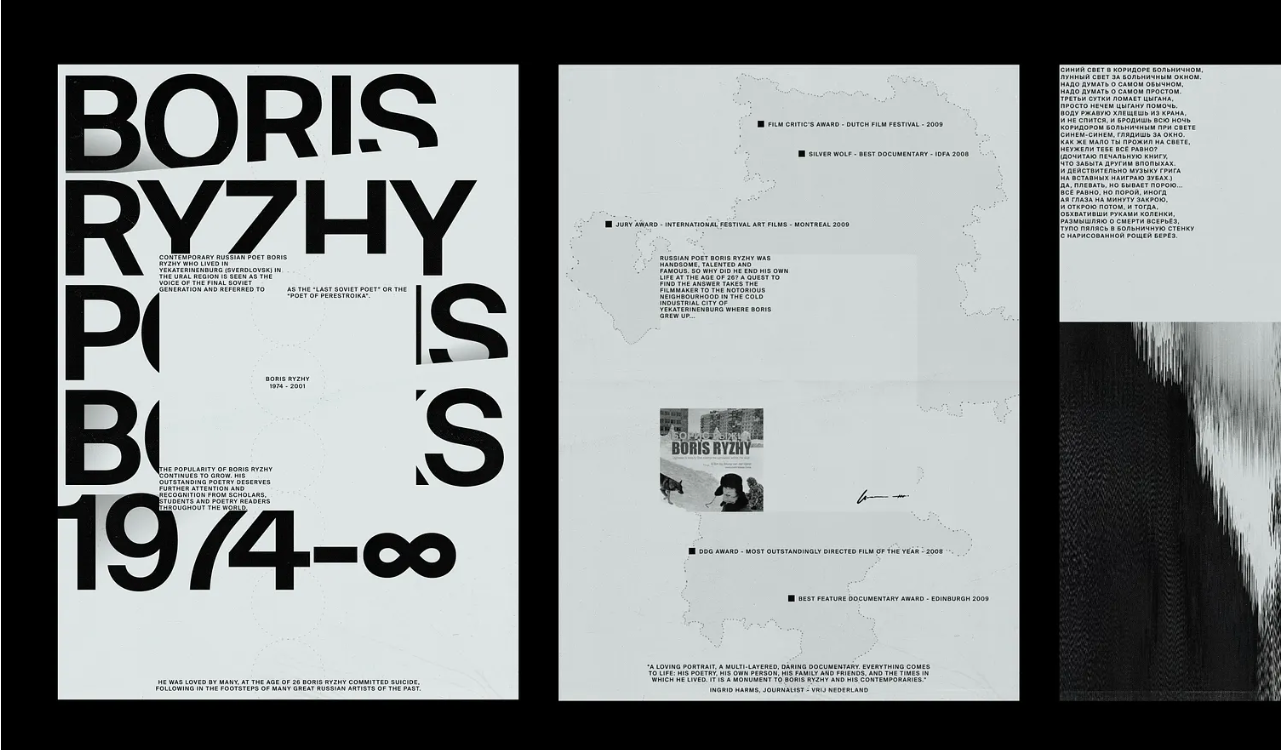
⚠️ Warning: A dramatic display face can create a strong mood while still making the message harder to find. Test expressive type at the actual viewing size before committing to it.
Contrast tells the eye what matters; spacing tells it what belongs together. That is where a poster stops feeling crowded and starts feeling composed.
Use whitespace to group information and direct the eye
Whitespace is not leftover area. It is the pause between sentences in a conversation. It separates ideas, creates emphasis, and prevents unrelated elements from merging into one visual problem.
Start by grouping content before adjusting individual margins. Keep the event name, subtitle, and image relationship tight if they form one idea. Put date, location, and call to action near one another if they form the action group. Then give larger gaps between groups than within them.
This “near means related” rule is more reliable than decorating empty space with extra lines, textures, or tiny type. If a poster looks empty after grouping, ask whether the primary message needs more confidence—not whether the canvas needs more objects.
The same principle applies to alignment. A strict grid can create calm, while an intentionally broken grid can create energy. Both work when the breaks are deliberate and the reading path remains intact.
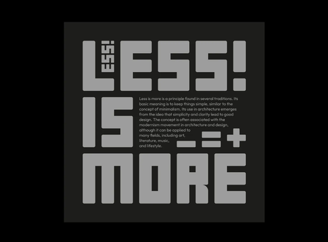
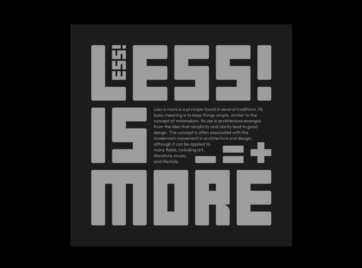
Current poster work still proves that bold type can carry a concept when it is controlled; Creative Bloq’s 2026 analysis of the Digger poster is a useful reminder that expressive choices land best when they serve the core idea.
With the groups established, you need to test the hierarchy outside the comfortable zoom level of your design tool.
Stress-test the hierarchy before you print or post
Do not wait for a final export to discover that the details disappear on a phone or the headline reads like a texture from across the room. Use a few fast tests while the design is still easy to change.
Thumbnail test: Zoom out until the poster is tiny. Can you still identify the primary message?
Distance test: Step away from the screen or print a rough draft. Does the intended reading order survive?
Blur test: Squint or apply a brief blur. The largest contrast relationships should remain.
Five-second test: Show it to someone unfamiliar with the project. Ask what they saw first, then what they think it is about.
Production test: Check the smallest information at its final print size or exported social size, not at 200% zoom.
The five-second test is particularly honest. If a viewer remembers the decorative pattern but not the event, the hierarchy has done the opposite of its job.
These tests turn vague feedback such as “make it pop” into usable diagnosis. From there, most hierarchy failures can be corrected without rebuilding the poster.
Fix common poster hierarchy failures without starting over
When a poster feels busy, resist the urge to add another accent. Remove or reduce one competing signal first.
Symptom | Likely cause | First repair |
|---|---|---|
Everything looks equally loud | Too many weights, colours, or large blocks | Choose one primary signal and quieten the rest. |
The title looks good but details vanish | Insufficient size or contrast at final output | Increase contrast, simplify the background, or regroup details. |
The layout feels empty | Whitespace is not attached to a hierarchy | Strengthen the primary group before adding decoration. |
The reading path feels random | Alignment and spacing do not reflect content groups | Rebuild the message ladder and set group gaps first. |
A font change did not solve it | The underlying priority is still unclear | Change the visual relationships, not just the family. |
This is why typography hierarchy posters are best treated as information design. Fonts carry personality, but hierarchy carries meaning. Once the message order, contrast, and spacing agree, even a simple type palette can feel decisive.
Let the message lead the poster
The strongest poster does not force a viewer to decode your design choices. It gives them a clear first impression, rewards a second look with context, and makes the next action easy to find.
For every typography hierarchy poster, start with the message ladder, build contrast from more than size, use whitespace to create relationships, and test at the distance where real people will see it. The result will not merely look more polished—it will communicate with confidence.
Tags
Linh Nguyen
Graphic Designer
Passionate Graphic Designer | Specializing in Illustration Design | Bringing Captivating Visuals to Life