Design tips
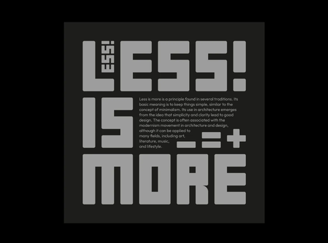
Typography Hierarchy Poster: A Practical Reading Path
You can choose a beautiful typeface, build a clever grid, and still end up with a poster that makes people work too hard. The problem is rarely that the headline
Tag Archive
9 posts matched this tag.
You can choose a beautiful typeface, build a clever grid, and still end up with a poster that makes people work too hard. The problem is rarely that the headline
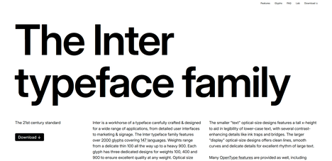
If you're new to design, you've probably noticed something confusing when browsing fonts: some cost money, some are free, and some seem to do things regular fonts can't. That last

Ask any group of working designers what they think about the career's future right now and you'll get two very different responses. The senior designers with established client relationships, strategic
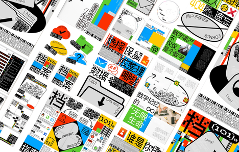
Here's a sentence I never thought I'd write: the most valuable design skill in 2026 is learning to draw a crooked line.Not because AI can't draw straight ones — it
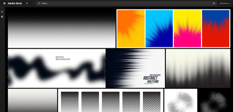
You open a design, apply the halftone filter, and the result looks — like a halftone filter. Dots in a gradient. Retro feel. Done.Except: the dots are fighting the type.

If you've scrolled through Instagram, browsed a beauty brand's latest packaging, or walked past a hotel lobby in the last eighteen months, you've felt it before you could name it.
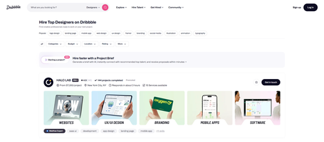
Hiring a graphic designer in 2026 isn't the same as it was five years ago. The tools have changed. The expectations have shifted. And yet, the same fundamental mistakes keep

Here's the trap almost every beginner falls into: you search "graphic design courses online for beginners," get hit with fifty listicles, pick the one with the prettiest thumbnail, and spend