Free Modern Handwriting Script Fonts from Google
The fastest way to make a design feel personal is also one of the easiest ways to make it look unfinished: pick a handwriting font because the preview looks charming, then use it everywhere. A bakery menu, wedding invitation, product label, and portfolio hero can all use script type beautifully, but they do not need the same kind of script.
This guide treats free modern handwriting script fonts from Google as design tools, not decorations. You will get a shortlist of Google Fonts that still feel useful in 2026, the best jobs for each one, the pairing rules that keep them readable, and the web-use choices that matter when the font moves from Figma to a live site.
The point is simple: choose the handwriting font by the job it needs to do, then let it speak in short, memorable moments.
Why Modern Handwriting Fonts Need More Than a Pretty Preview
Handwriting fonts carry instant emotion. They can make a brand feel warm, relaxed, handmade, playful, romantic, or personal before a reader has processed a single word. That is why they show up so often in food branding, wedding stationery, creator identities, beauty packaging, craft labels, and social graphics.
The risk is that the same personality becomes noise when the font is used without restraint. A script headline can feel inviting. A full paragraph in the same script can feel like homework. A casual handwritten logo can feel approachable. The same font on a pricing table can feel unserious.
Google's own Handwriting category is broad: it covers fonts that imitate the human hand, from loose marker styles to elegant cursive forms. That range is useful, but it also means "handwriting" is not a style direction by itself. You still need to decide whether the project needs polish, warmth, speed, elegance, humor, or authenticity.
There is also a technical side. Google Fonts are free and open source for commercial and non-commercial projects, as explained in the Google Fonts developer documentation, but implementation choices still matter. Designers and developers regularly debate CDN loading, privacy, self-hosting, and font performance, especially in regions where third-party requests create compliance concerns.
So the better question is not "Which one is prettiest?" It is "Which one gives this project the right voice without making the design harder to read or ship?"
The 2026 Selection Framework: Use Case, Readability, Tone, and Implementation
Before choosing a handwriting font, run it through four quick checks.
First, define the use case. A restaurant menu needs fast scanning. A wedding invitation can afford more flourish. A handmade soap label needs warmth at small sizes. A social quote graphic needs instant mood. A website hero needs personality without slowing the whole page down.
Second, test readability with real words from the project. Do not judge the font only from "The quick brown fox jumps over the lazy dog." Try the brand name, product names, prices, dates, addresses, and the longest heading. If the lowercase r, s, e, and a blur together, the font is not ready for functional text.
Third, match the tone. Script fonts are not automatically feminine, luxury, casual, or handmade. Style Script feels polished and retro. Just Another Hand feels quick and casual. Marck Script feels confident and informal. The right choice depends on the emotional job.
Fourth, plan the implementation. If the font is for a live site, check the available weights, language support, and file size. If the audience includes privacy-sensitive users or EU traffic, consider downloading and self-hosting the font files from Google Fonts rather than loading them from a third-party CDN.
Think of the handwriting font like a signature on packaging. It can make the piece feel human, but it should not be asked to carry every ingredient list, legal line, and instruction panel.
Best Free Modern Handwriting Script Fonts from Google by Project Type
Here are the strongest free modern handwriting script fonts from Google for practical design work in 2026.
1. Playwrite Nigeria Modern (Playwrite NG Modern)
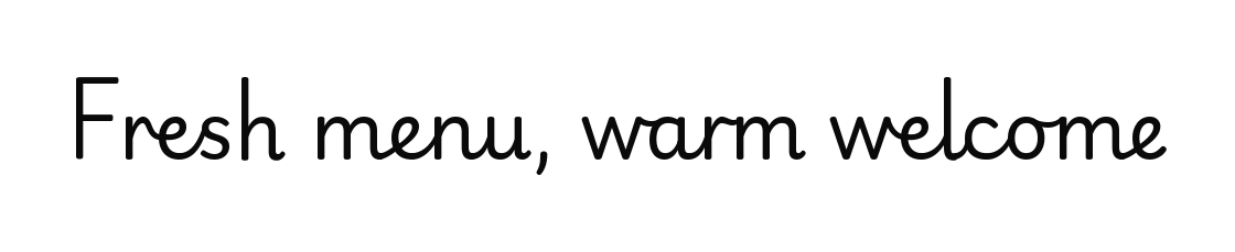
Playwrite NG Modern appears in the catalog as Playwrite Nigeria Modern; its font-family name remains Playwrite NG Modern. It is a shortlist option for a modern handwriting accent. The Google Fonts family metadata lists one upright variable font with a weight axis from 100 to 400, rather than separate italic styles. This gives you a range of weights for short display text.
Use it for education brands, creator portfolios, soft editorial accents, personal stationery, or warm web details where you want handwriting without a messy texture. The "Modern" quality makes it feel more current than older novelty scripts, and the lighter weights can look refined in large display settings.
Avoid using the thinnest weights for small mobile text or low-contrast colors. It is best as a headline, pull quote, label, or short phrase.
2. Marck Script

Marck Script is a casual script with a hand-lettered feel, but its biggest strength is practical: the characters are not tightly connected. That allows more flexibility in letter spacing; test readability with your actual words and display size.
Use it for friendly logos, cafe graphics, handmade product labels, informal blog headers, and short website hero lines. It has enough movement to feel personal without becoming too ornamental.
Avoid long paragraphs. Marck Script is readable for a script, not a replacement for a body font.
3. Nanum Pen Script

Nanum Pen Script has a warm, contemporary pen quality. It feels less like a wedding invitation and more like a quick personal note, which makes it useful for brands that want approachable energy.
Use it for lifestyle graphics, friendly packaging, personal brands, editorial callouts, or projects with Korean-language influence where the broader Nanum family context may be useful.
Avoid pairing it with another expressive font. Nanum Pen Script already has a strong voice, so let the supporting type stay quiet.
4. Style Script

Style Script has an upright mid-century feel that can move between casual and formal. It is a good choice when a project needs polish but not full luxury calligraphy.
Use it for boutique branding, beauty labels, retro-modern event graphics, dessert packaging, or hero headlines that need a little ceremony.
For a raw, handmade, or intentionally imperfect direction, compare Style Script with rougher lettering using your actual brand text. Its smooth appearance may suit some briefs better than others.
5. Cedarville Cursive

Cedarville Cursive feels like a personal handwritten note. It is less polished than formal scripts, which is exactly why it can work for intimate, casual, or human moments.
Use it for thank-you cards, invitation accents, journal-style graphics, creator notes, or small pieces of copy that should feel written rather than typeset.
Avoid it for menu items, product specs, or anything a customer must scan quickly.
6. Just Another Hand

Just Another Hand is narrow, casual, and brush-like. It works when you want the energy of fast lettering rather than elegant script.
Use it for posters, playful labels, informal badges, YouTube thumbnails, workshop graphics, and handmade event materials.
Avoid it for long brand names or narrow mobile layouts. The condensed shapes can get crowded if the words are already long.
These fonts cover very different moods, which is exactly the point: the best handwriting font is the one that solves the visual problem in front of you.
How to Pair Handwriting Fonts Without Making the Design Feel Amateur
The simplest pairing rule is this: let the handwriting font do one job, and let a readable sans or serif do everything else.
For modern brands, pair a script headline with a clean sans serif such as Inter, Source Sans 3, Work Sans, or DM Sans. The handwriting font adds personality; the sans serif handles navigation, body copy, pricing, captions, and forms.
For softer editorial or wedding work, pair an elegant script with a calm serif such as Lora, Cormorant Garamond, or Libre Baskerville. Keep the serif readable and restrained so the script remains the focal point.
For food, craft, and handmade brands, pair a casual handwriting font with a sturdy sans or slab-style companion. The pairing should feel like a label system: expressive brand mark at the top, clear product information underneath.
The common mistake is pairing two fonts that both want attention. A brush script plus a quirky display sans plus a decorative serif does not feel layered; it feels undecided. If the handwriting font is the voice, the supporting font is the room tone.
When in doubt, set the script in fewer words and more space. Handwriting fonts almost always look more expensive when they are allowed to breathe.
Web Use Notes: Google CDN, Self-Hosting, Bunny Fonts, and Performance
Using Google Fonts on a website is simple: choose a family, copy the embed code, and apply it in CSS. For many small projects, that is enough. The Google Fonts developer docs explain the standard embed path and confirm the library's open-source availability.
For client work, production sites, or privacy-sensitive brands, take one extra step and choose the loading strategy intentionally.
Use the Google Fonts CDN when speed and convenience matter most, the project is low-risk, and the client is comfortable with a third-party font request.
Self-host the font when you need tighter control over privacy, caching, uptime, or compliance. Download only the weights and styles you use. A handwriting font used for one logo-style heading does not need a heavy family loaded across the entire site.
Consider a privacy-focused mirror such as Bunny Fonts when you want a Google Fonts-compatible workflow with a different delivery model. Developer communities debate this topic heavily, especially after privacy and GDPR discussions around third-party font loading.
Also remember that handwriting fonts are usually display fonts. Load them where they are needed, use font-display: swap, and keep the fallback acceptable. A beautiful script is not worth a blank hero headline or a jumpy first impression.
Good web typography is invisible when it works. The reader feels the brand personality, but the page still loads cleanly and reads easily.
Quick Picks and Avoidance Rules for Menus, Logos, Packaging, and Social Graphics
Use this as a practical shortcut when the project is moving fast.
For restaurant menus, start with Marck Script for headings only, then use a clean sans serif for item names, descriptions, and prices. Avoid thin cursive for anything a guest reads under dim lighting.
For bakery or handmade packaging, try Nanum Pen Script or Just Another Hand for a warm label accent. Keep ingredients, weight, and care instructions in a neutral companion font.
For wedding and event graphics, use Style Script or Cedarville Cursive depending on the mood. Style Script feels more polished; Cedarville Cursive feels more personal.
For creator brands and portfolios, try Playwrite NG Modern for a signature-like accent. It feels current without forcing the whole identity into a decorative style.
For social quote graphics, choose the font based on scanning speed. The first line can be expressive, but the message should still be readable on a phone in two seconds.
For logos, test repeated letters and awkward combinations before committing. Words with double letters, tight counters, or long descenders can expose the limits of a handwriting font quickly.
Avoid using script for all caps unless the specimen proves it works. Avoid centered paragraphs in cursive. Avoid low-contrast pastel text. Avoid using three handwriting fonts in one layout. And avoid choosing a font because it looks good in someone else's mockup; use your own words first.
Free modern handwriting script fonts from Google can absolutely look professional in 2026. The trick is restraint. Pick one font with a clear job, pair it with something quiet, and test it in the real places customers will see it. That is when a free font starts feeling like a deliberate brand choice instead of a shortcut.
Tags
Linh Nguyen
Graphic Designer
Passionate Graphic Designer | Specializing in Illustration Design | Bringing Captivating Visuals to Life