Kids Book Illustration Style: How to Choose the Right One
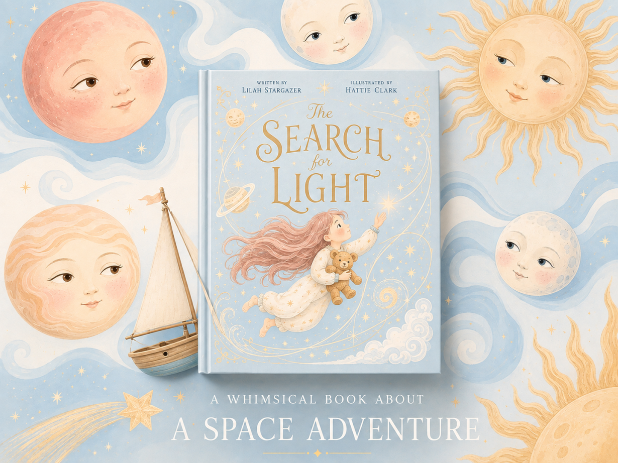
I watched a first-time author spend $8,000 on gorgeous watercolor illustrations for a board book aimed at toddlers. The art was stunning — delicate, layered, full of subtle color gradients. It was also completely wrong for the audience. Toddlers need bold shapes and high contrast, not nuanced brushwork they can't process yet. The book flopped, and the author had to start over.
Choosing a kids book illustration style isn't about picking what looks pretty in your head. It's about matching visual language to your reader's developmental stage, your story's emotional tone, and your actual budget. Most guides give you a list of styles — watercolor, digital, collage — and leave you to guess which one fits. This post does the opposite: it shows you exactly how to match style to age group, genre, and budget, with real examples of what works and what doesn't.
Here's what you'll learn: the five core illustration styles and when each one works, how to match style to your target age group (0-3, 4-8, 9-12), what each style actually costs, why the digital vs traditional debate misses the point, the biggest mistake first-time authors make, and how to test your style before committing thousands of dollars.
The Five Core Illustration Styles (and When Each One Works)
Every kids book illustration style falls into one of five categories. Understanding what each style communicates — and which age groups respond to it — is the first decision you need to make.
Watercolor creates a soft, dreamy, organic feel. The translucent layers and visible brushstrokes give illustrations warmth and movement. Watercolor works best for gentle stories, nature themes, and emotional narratives. Age fit: 4-8 years old. Younger kids (0-3) struggle with the subtlety; older kids (9-12) often find it too "babyish" unless the execution is sophisticated. Budget: $2,000-$6,000 for a 32-page picture book if you hire a professional watercolor illustrator.
Digital painting mimics traditional media but with infinite undo and faster iteration. It's the most versatile style — you can make it look like watercolor, oil paint, or something entirely new. Digital painting dominates modern children's publishing because it's cost-effective and deadline-friendly. Age fit: all ages, depending on execution. A bold, graphic digital style works for toddlers; detailed digital painting works for middle-grade readers. Budget: $1,500-$5,000 for a 32-page book. Digital illustrators can work faster, which lowers costs.
Collage uses cut paper, fabric, or mixed media to create textured, tactile illustrations. Collage feels playful and hands-on, which makes it perfect for interactive stories or books about making things. The style has a distinct personality — it's quirky, not polished. Age fit: 4-8 years old. Toddlers love the bold shapes, but the style's complexity can overwhelm them. Older kids appreciate the craft but may see it as too young. Budget: $2,500-$7,000. Collage is labor-intensive, especially if the illustrator works with physical materials.
Line art strips illustrations down to outlines and minimal color. It's clean, modern, and leaves room for the reader's imagination. Line art works for concept-driven books, humor, and stories where the text carries most of the narrative weight. Age fit: 6-12 years old. Younger kids need more visual information; older kids and adults appreciate the simplicity. Budget: $1,000-$3,000. Line art is faster to produce, which makes it the most budget-friendly option.
Mixed media combines two or more techniques — watercolor backgrounds with digital characters, collage elements with painted details, photography with illustration. Mixed media creates visual richness and uniqueness, but it's also the hardest style to execute well. Age fit: 4-12 years old, depending on complexity. Budget: $3,000-$10,000+. Mixed media requires multiple skill sets, which drives up costs.
The style you choose sets the emotional tone before a single word is read. Watercolor whispers; digital painting can shout or whisper depending on execution; collage plays; line art simplifies; mixed media surprises. Match the style to the story's emotional core, not to what's trending on Instagram.
How to Match Illustration Style to Your Target Age Group
Age-appropriate illustration isn't about dumbing things down — it's about matching visual complexity to cognitive development. Get this wrong, and your book won't connect no matter how good the art is.
Ages 0-3 (board books, first picture books): Toddlers process bold shapes, high contrast, and simple compositions. Their visual systems are still developing, so subtle color gradients and detailed backgrounds don't register. What works: digital painting with bold, flat colors; simple collage with clear shapes; line art with thick outlines and minimal detail. What doesn't work: watercolor with subtle layering; mixed media with busy compositions; any style that relies on fine detail. Example: Look at Brown Bear, Brown Bear, What Do You See? by Eric Carle — bold collage shapes, high contrast, zero visual clutter.
Ages 4-8 (picture books): This is the sweet spot for detailed illustration. Kids in this age range can process complex compositions, follow visual narratives across spreads, and appreciate expressive character faces. They're also developing emotional literacy, so illustrations that show nuanced emotions help them learn. What works: watercolor with layered detail; digital painting with expressive characters; collage with personality; mixed media that tells a visual story. What doesn't work: overly simple line art (they'll find it boring); illustrations that don't show character emotion; styles that feel too "baby" or too "grown-up." Example: Where the Wild Things Are by Maurice Sendak — detailed cross-hatching, expressive monster faces, compositions that build tension.
Ages 9-12 (chapter books with illustrations, graphic novels): Older kids appreciate sophisticated composition, visual metaphor, and stylistic risk-taking. They're also more critical — if the art feels condescending or too childish, they'll reject the book. What works: line art with personality; digital painting with mood and atmosphere; mixed media that feels intentional; any style executed with confidence. What doesn't work: overly cute or simplistic styles; illustrations that feel like they're "for little kids"; anything that talks down to the reader. Example: The Arrival by Shaun Tan — wordless graphic novel with intricate, surreal illustrations that trust the reader to interpret meaning.
The biggest mistake I see: choosing a style because it's popular, not because it serves your specific age group. A style that works for a 5-year-old will feel wrong for a 10-year-old, and vice versa. Test your style with actual kids in your target age range before you commit.
The Real Cost of Each Illustration Style
Let's talk real numbers, because "it depends" doesn't help you budget. These are 2026 rates for a standard 32-page picture book (14 spreads + cover).
DIY digital illustration: $0-$500. If you're illustrating your own book, your costs are software (Procreate $13, Photoshop $55/month, or free tools like Krita) and learning time. The hidden cost: your time. Expect 100-200 hours to illustrate a 32-page book if you're learning as you go. This path works if you have illustration skills or if your book is a passion project, not a commercial venture.
Freelance illustrator (emerging): $1,000-$3,000. You'll find illustrators at this rate on platforms like Fiverr, Upwork, or Reedsy. Quality varies wildly. At the low end ($1,000), expect basic digital work with limited revisions. At the high end ($3,000), you'll get solid professional work from someone building their portfolio. Turnaround: 2-4 months.
Freelance illustrator (professional): $3,000-$8,000. This is the standard rate for experienced children's book illustrators with published work. You're paying for skill, reliability, and a style that's been market-tested. Expect 3-5 rounds of revisions, print-ready files, and a contract that clarifies rights. Turnaround: 3-6 months. Find these illustrators through the Society of Children's Book Writers and Illustrators (SCBWI), platforms like Reedsy that vet professional illustrators, or by reaching out to illustrators whose published work you admire.
Professional studio or high-demand illustrator: $8,000-$20,000+. At this tier, you're hiring someone with a recognizable style, a track record of bestsellers, or a studio that handles the entire production process. This is where traditional publishers operate. Unless you're self-publishing with serious commercial ambitions, this tier is overkill.
Style-specific cost differences: Watercolor and mixed media cost more because they're labor-intensive. Digital painting costs less because iteration is faster. Line art costs the least because it's the quickest to produce. Collage sits in the middle — physical collage costs more than digital collage.
Hidden costs to budget for: Cover design (if not included in the illustration package), print-ready file prep, revisions beyond the agreed scope, and rush fees if you're on a tight deadline. Add 15-20% to your illustration budget as a buffer.
The budget trap: paying for a style that's more expensive than your story needs. A simple board book doesn't need $8,000 watercolor illustrations. A middle-grade graphic novel doesn't need $15,000 mixed media. Match your budget to your book's commercial potential, not to your ego.
Digital vs Traditional: What Actually Matters to Readers
Here's the truth no one wants to hear: readers don't care whether your illustrations are digital or traditional. They care whether the art connects emotionally and serves the story.
I've seen authors agonize over whether to hire a watercolor artist or a digital painter, as if the medium itself determines quality. It doesn't. A bad watercolor illustration is still bad. A great digital painting is still great. The medium is a tool, not a guarantee.
What digital does well: Speed, iteration, and cost-efficiency. A digital illustrator can try 10 color palettes in the time it takes a traditional artist to mix paint. Digital files are print-ready with no scanning or color correction. If you're on a tight deadline or budget, digital wins.
What traditional does well: Texture, uniqueness, and a certain warmth that's hard to replicate digitally. Traditional media — especially watercolor and collage — have a handmade quality that feels personal. If your story's emotional tone is gentle, nostalgic, or tactile, traditional media might be the better fit.
The hybrid approach: Most professional illustrators in 2026 work digitally but mimic traditional media. They paint digitally in a way that looks like watercolor, or they create digital collage that feels like cut paper. The result: the warmth of traditional media with the efficiency of digital tools. This is the standard in modern children's publishing.
What actually matters: Emotional connection and visual clarity. Does the illustration make the reader feel something? Can a 5-year-old follow the visual narrative across spreads? Does the style match the story's tone? These questions matter infinitely more than whether the art was made with a brush or a stylus.
The decision isn't digital vs traditional — it's finding an illustrator whose style serves your story, regardless of their tools.
The Biggest Mistake First-Time Authors Make
The mistake: choosing an illustration style because you like it, not because it serves the story and target audience.
I see this constantly. An author falls in love with a whimsical watercolor style they saw on Pinterest, hires an illustrator to replicate it, and then wonders why their action-packed adventure story feels flat. Or they choose a minimalist line art style because it's trendy, and their emotional family story loses all its warmth.
Your personal taste doesn't matter. Your reader's experience matters.
Here's the test: show your illustration style to three people in your target age group (or their parents, if your readers are toddlers). Don't explain the story. Just show them a sample spread and ask: "What do you think this book is about? How does it make you feel?" If their answers don't match your story's tone and genre, your style is wrong.
Other common mistakes:
Choosing a style that's too complex for your budget. If you can only afford $2,000 for illustrations, don't hire someone whose portfolio is full of intricate mixed media work. You'll get a rushed, compromised version of their style. Instead, find an illustrator whose natural style fits your budget.
Ignoring the illustrator's portfolio. If an illustrator's portfolio is full of cute animals and you're writing a gritty urban story, they're not the right fit. Hire for style match, not just skill level.
Skipping the contract. Always clarify: how many revisions are included, who owns the rights, what file formats you'll receive, and what happens if the project goes over deadline. A $5,000 illustration job without a contract is a $5,000 gamble.
Not testing the style before committing. Pay for 1-2 sample spreads before commissioning the full book. If the style doesn't work, you've lost $200-$500, not $5,000.
The fix: make every style decision with your reader in mind, not your Pinterest board.
How to Test Your Illustration Style Before Committing
You don't have to guess whether your chosen style will work. Test it before you spend thousands of dollars.
Step 1: Commission 2-3 sample spreads. Most illustrators will create sample spreads for $150-$300 per spread. Pick key moments from your story — the opening, a high-emotion scene, and the climax. This gives you a sense of how the style handles different narrative beats.
Step 2: Print the samples at actual book size. Digital mockups lie. Print your sample spreads at the size your book will be (usually 8x10 or 10x10 inches for picture books) and hold them in your hands. Does the detail hold up? Are the colors too bright or too muted? Does the composition feel balanced on the page?
Step 3: Test with your target age group. Show the printed samples to 3-5 kids in your target age range. Don't lead them — just hand them the pages and watch. Do they engage with the images? Do they ask questions? Do they flip back to look again? If they're bored or confused, your style isn't working.
Step 4: Get feedback from industry professionals. Join SCBWI or a children's book critique group and show your samples to people who know the market. Stay current with what's selling by following industry publications like Publishers Weekly's children's book coverage. Industry professionals will tell you if your style is too trendy, too dated, or too niche to sell.
Step 5: Iterate based on feedback. If the style isn't working, don't throw it out entirely — adjust. Maybe the color palette needs to be bolder. Maybe the characters need more expressive faces. Maybe the compositions are too busy. Small tweaks can save a style that's 80% there.
The cost of testing: $500-$1,000 for sample spreads + printing + feedback. The cost of not testing: $5,000+ for a full set of illustrations that don't work.
Testing isn't optional if you're serious about your book. It's the difference between a style that serves your story and a style that sinks it.
Choosing a kids book illustration style isn't about trends or personal taste — it's about matching visual language to your reader's developmental stage and your story's emotional core. The five core styles (watercolor, digital painting, collage, line art, mixed media) each communicate something different. Your job is to pick the one that serves your specific age group (0-3, 4-8, 9-12), fits your budget ($1,000-$10,000+), and makes your story feel the way it should.
The digital vs traditional debate is a distraction. What matters is emotional connection and visual clarity. Test your style with real readers before you commit. And remember: the best illustration style is the one your reader doesn't notice because they're too busy living inside your story.
Tags
Linh Nguyen
Graphic Designer
Passionate Graphic Designer | Specializing in Illustration Design | Bringing Captivating Visuals to Life