How to Implement Data-Driven Design (Without Losing Creativity)

You've probably heard the pitch: "Stop guessing. Let the data decide." Sounds reasonable until you realize that following data to its logical conclusion means designing everything in Helvetica, making every button green, and A/B testing your way to the most clickable — and most soulless — version of your work. I'm a graphic designer, not a data analyst. When someone tells me to be "data-driven," my instinct is to defend every creative decision I've ever made. But here's what I've learned after actually implementing data-driven design on real projects: data doesn't replace your eye. It gives your eye a feedback loop. This guide shows you how to implement data-driven design step by step — as a designer, not a statistician — without sacrificing the creative judgment that makes your work worth looking at in the first place.
Why "Data-Driven Design" Sounds Scary (And Why It Shouldn't)
Let's name the fear directly. When designers hear "data-driven," they hear:
"Your opinion doesn't matter anymore."
"The dashboard knows better than you."
"Just test everything and do whatever wins."
That's not data-driven design. That's data-dependent design, and it's a recipe for mediocre work.
The real promise of data-driven design is much simpler: you make a creative decision, you measure how it performs, you learn, you iterate. That's it. It's the same feedback loop you already use when a client says "I don't love it" — except now the feedback comes from actual user behavior instead of subjective opinions.
Think of it this way: a photographer doesn't stop composing shots just because they have a light meter. The light meter doesn't make the creative decisions — it tells you whether the exposure is technically correct. Data in design works the same way. It doesn't tell you what to design. It tells you whether what you designed is working.
Once you frame it as a feedback loop rather than a replacement, the implementation gets a lot less intimidating. But first, there's a distinction you need to understand that most articles skip entirely.
Data-Driven vs Data-Informed: The Distinction That Changes Everything
This is the single most misunderstood concept in the space, and getting it right determines whether data helps your work or hijacks it.
Data-driven design means data is the primary decision-maker. You run an A/B test, the variant with the higher conversion rate wins, and you ship it. There's little room for designer intuition in the final call. This works well for optimization problems — button placement, CTA copy, checkout flow — where the goal is clearly measurable and the design space is narrow.
Data-informed design means data is one input among several. You look at the numbers, but you also weigh your design experience, the brand's emotional goals, qualitative user feedback, and business strategy. Data informs the decision; it doesn't make it for you.
Here's the practical difference: Maze's interview with Chris Linnett (former design lead at Microsoft and Spotify) highlights a real example. Spotify tested a dark interface against a light one. Designers assumed users would prefer light. Data showed dark won decisively. A purely data-driven approach would ship dark and move on. A data-informed approach asks: why did dark win? Is it readability? Is it late-night usage? What does this tell us about our users' context? The answer shapes every future interface decision, not just this one.
💡 Tip: Default to data-informed. Use data-driven only when the design question is narrow and the metric is unambiguous (like "which checkout button color converts better?"). For everything else — brand identity, visual language, emotional design — let data inform, not dictate.
With that distinction clear, let's get into the actual implementation.
How to Implement Data-Driven Design: A Step-by-Step Framework
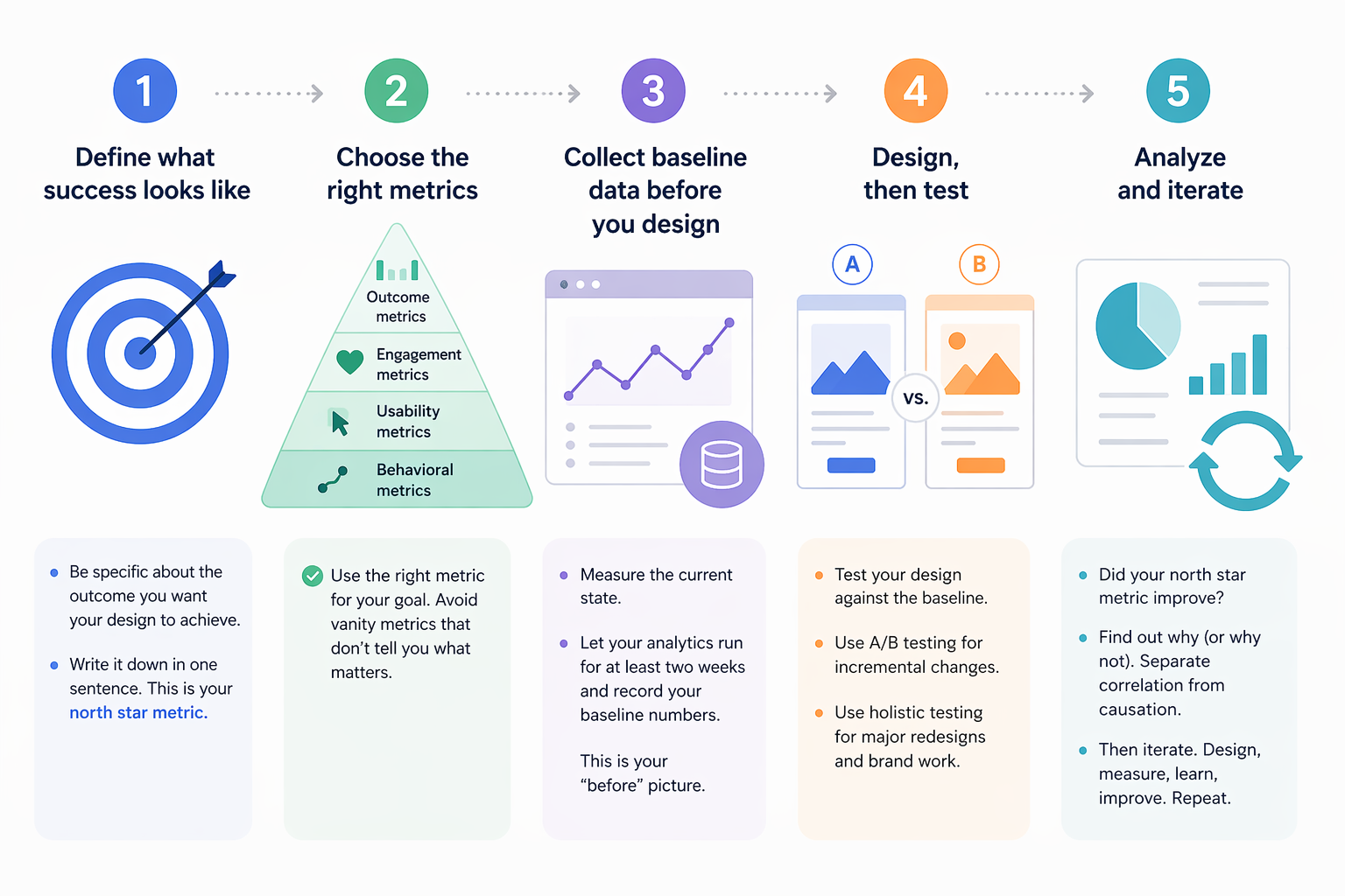
This is the framework I use. Five steps, no PhD required.
Step 1: Define what success looks like
Before you open any analytics tool, answer this question: What does a successful design outcome look like for this project? Not "more clicks" — that's a vanity metric. Think about what the design is actually supposed to achieve.
Redesigning a landing page? Success might be: more sign-ups from the target audience segment.
Refreshing a brand identity? Success might be: higher brand recall in a survey, or more engagement on social posts using the new identity.
Improving a newsletter layout? Success might be: higher click-through rate on the primary story, fewer unsubscribes.
Write it down. One sentence. This becomes your north star metric — the one number that tells you whether the design is working.
Step 2: Choose the right metrics
Not all metrics are created equal. Here's a practical hierarchy for designers:
Metric Type | Examples | When to Use |
|---|---|---|
Outcome metrics | Conversion rate, sign-ups, purchases | When the design has a clear business goal |
Engagement metrics | Time on page, scroll depth, interaction rate | When you're measuring content consumption or visual impact |
Usability metrics | Task completion rate, error rate, time-to-complete | When you're testing interface clarity |
Behavioral metrics | Heatmap clicks, navigation paths, rage clicks | When you need to understand how people use a design |
Avoid vanity metrics (page views, total clicks) that look impressive but don't tell you whether your design decisions are working.
Step 3: Collect baseline data before you design
This is the step most designers skip, and it's the most important one. Before you change anything, measure what's happening now. That baseline tells you whether your redesign actually improved things — or just changed them.
Set up your analytics tool (more on tools below), let it run for at least two weeks on the current design, and record your baseline numbers. This is your "before" picture.
Step 4: Design, then test
Create your design. Then test it against the baseline. Two approaches:
Incremental testing: Change one element at a time, measure the impact. Good for optimizing existing designs. A/B testing is the standard method here — show version A to half your users and version B to the other half, see which performs better.
Holistic testing: Launch the full redesign, measure the outcome against your baseline. Good for brand redesigns or major visual overhauls where testing individual elements misses the point.
For graphic designers working on brand and visual identity, holistic testing is usually more appropriate. The emotional impact of a brand system comes from how all the elements work together — testing the logo in isolation won't tell you much.
Step 5: Analyze and iterate
Look at the data. Did your north star metric improve? If yes, understand why — so you can replicate that success. If no, understand why not — so you can fix it.
The key discipline: separate correlation from causation. Just because sign-ups increased after your redesign doesn't mean the redesign caused it. Maybe a marketing campaign launched the same week. Control for external factors before drawing conclusions.
Then iterate. Data-driven design is not a one-time event — it's a continuous loop of designing, measuring, learning, and improving.
But there's a trap waiting for you in this loop, and it's where most teams go wrong.
The Metrics That Actually Matter for Designers
Most analytics guides are written for product managers. They'll tell you to track DAU, MAU, retention curves, and funnel conversion. Important numbers — but none of them tell you whether your typography is working or your color palette is hitting the right emotional note.
Here are the metrics I've found most useful as a graphic designer:
Scroll depth. Are people actually seeing your design, or are they bouncing before they scroll past the hero section? This tells you whether your visual hierarchy is pulling people in.
Interaction heatmaps. Where do people click, hover, and tap? This reveals whether your design's visual weight matches the user's actual behavior. If everyone's clicking the decorative element and ignoring the CTA, your visual hierarchy is misaligned.
Time-to-action. How long does it take someone to complete the intended action after landing on a page? Faster usually means your design is clear. Slower might mean confusion — or deep engagement, depending on context.
Brand recall (qualitative). Show your design to users, then ask them to describe the brand. If their answers match your intent, the design is communicating. If they say "generic" or "confusing," you have a problem no heatmap will detect.
The HEART framework (Happiness, Engagement, Adoption, Retention, Task Success) from Google is a useful structure for organizing these metrics. It forces you to think beyond clicks and consider the full spectrum of design impact.
Now, about that trap I mentioned.
The Local Maxima Trap: When Data Leads You Astray
Here's the dirty secret of A/B testing: it's incredibly good at finding the local maximum — the best version of what you already have — and terrible at finding the global maximum — the best possible design.
Imagine you're A/B testing a call-to-action button. You test ten colors and find that coral outperforms blue by 3%. Great. You ship coral. But what if a completely different page layout — one you never tested — would have doubled conversions? You optimized your way to the top of a small hill while a mountain stood unclimbed.
Spotify ran into this. Their designers found that incremental A/B testing improved individual features but made the overall experience feel disjointed. The solution: they stopped testing every change and instead ran holistic experiments on complete experience redesigns. The result was the major Spotify redesign that felt cohesive instead of piecemeal.
Practical rules to avoid the local maxima trap:
Don't A/B test everything. Reserve testing for decisions where the design space is narrow and the metric is clear.
Schedule regular "creative sprints" where you explore bold redesigns without any data constraints. Then test those redesigns holistically against the current version.
When your A/B tests keep producing marginal improvements (1–2% gains), that's a signal you've reached a local maximum. Time to zoom out.
Always combine quantitative data with qualitative research. Numbers tell you what is happening. User interviews tell you why.
⚠️ Warning: If your team ships exclusively based on A/B test results, you will converge on the most average version of everything. Bold design requires the confidence to sometimes override the data — and the discipline to measure whether that confidence was justified.
Understanding the trap is half the battle. The other half is having the right tools to collect and act on data without drowning in dashboards.
Tools for Data-Driven Design (From Free to Enterprise)
You don't need a massive analytics stack to start. Here's what I recommend based on budget and need:
Free tier / starter tools:
- Google Analytics — The baseline. Page views, bounce rate, traffic sources, basic conversion tracking. Every designer should have this running. Free.
- Microsoft Clarity — Free heatmap and session recording tool. See exactly where users click, scroll, and get confused. No excuse not to use this — it's completely free.
- Canva Analytics — If you design social content in Canva, their built-in analytics show engagement per design. Useful for understanding which visual styles perform.
Mid-range ($20–100/month):
- Hotjar — Heatmaps, session recordings, user surveys, and feedback widgets. The most designer-friendly analytics tool I've used. The visual output maps directly onto design decisions.
- Maze — Design testing platform. Run usability tests on prototypes before you build. Validates design decisions early. Maze's data-driven design guide is also one of the best resources on this topic.
Enterprise / advanced:
- Mixpanel — Product analytics with deep event tracking. Overkill for most graphic designers, but essential if you're designing interactive products.
- Optimizely — Enterprise A/B testing and experimentation platform. When you need statistical rigor and complex multivariate tests.
Start with Google Analytics and Microsoft Clarity. They're free, they cover the essentials, and they'll teach you what questions to ask before you pay for more advanced tools.
The tool doesn't make you data-driven. The habit of measuring, learning, and iterating does.
Your Creative Judgment Is the Engine — Data Is the Steering
Implementing data-driven design doesn't mean becoming a data analyst. It means being a designer who listens to reality as well as intuition. Start by defining what success looks like. Collect baseline data before you redesign. Choose metrics that actually reflect design quality, not just traffic. Test thoughtfully — not everything, not obsessively, but consistently. And watch for the local maxima trap that turns incremental optimization into creative stagnation.
The best designers I know don't choose between data and creativity. They use data to make their creativity more effective — and their creativity to ask better questions of the data. That's the feedback loop, and it starts with one simple question: How will I know if this design worked?
Linh Nguyen
Graphic Designer
Passionate Graphic Designer | Specializing in Illustration Design | Bringing Captivating Visuals to Life


