UI Pattern Library vs Design System: The Decision Framework
A post on r/UXDesign recently exploded — thousands of upvotes, hundreds of comments — with a title that captured how a lot of designers feel: "I Hate Design Systems." The complaints were specific and visceral. Systems kill creativity. They slow things down. They create corporate overhead that benefits the org chart, not the product. 80 components get built, but only 23 ever get used.
Here is the uncomfortable truth the comments section surfaced: most of those designers were not complaining about design systems. They were complaining about pattern libraries being called design systems, or about full enterprise design systems being forced on three-person teams that needed nothing more than a shared color palette.
The problem is not the tool. The problem is using the wrong tool for your team's actual size and stage.
This post gives you a clear framework for understanding the difference between a pattern library, component library, style guide, and design system — and more importantly, a way to decide which one you actually need right now.
The Hierarchy Problem
The four terms — pattern library, component library, style guide, and design system — get used interchangeably in job postings, tool marketing, and even internal team chats. But they describe fundamentally different things with different levels of investment, maintenance, and organizational scope, as Brad Frost's Atomic Design framework maps out at the component level.
Understanding the hierarchy matters because mislabeling leads to overbuilding. If you call a component library a design system, you start adding governance processes and contribution models to something that should just be a shared folder of buttons. If you call a pattern library a style guide, you miss the documentation that makes it actually usable. The UXPin 2026 comparison article defines the hierarchy clearly.
The hierarchy is simple:
Design System is the umbrella. It contains everything else plus governance, design principles, and processes for how the system grows and changes over time.
Pattern Library is a collection of reusable UX solutions — how components compose together to solve real user problems.
Component Library is the coded implementation of individual UI elements — buttons, inputs, modals, cards.
Style Guide is the visual rulebook — colors, typography, spacing, brand voice.
Each serves a different purpose, requires a different level of investment, and is appropriate at a different stage of team maturity.
What Each Thing Actually Is
Let us define each one clearly with what it includes and who it serves.
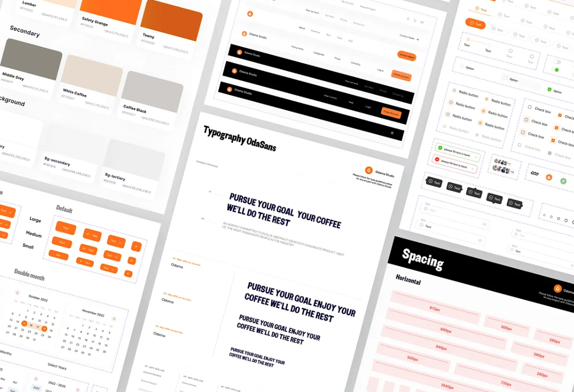
A style guide defines the visual rules. Your color palette, typography scale, spacing grid, icon style, and brand voice live here. It answers the question "what does our brand look like?" It serves designers, marketers, and content creators. A style guide can live in a Figma file, a PDF, or a Notion page. It does not need code.
A component library is a collection of coded UI elements. Buttons, inputs, selects, modals, cards — each built as a reusable component with documented props and states. It answers the question "what button do I grab?" It primarily serves developers, with design specs in Figma as the source of truth for visual properties.
A pattern library sits one level above components. It documents how components work together to solve recurring UX problems — authentication flows, search-with-filters, data tables with actions, form validation. It answers the question "how do I build a login form using our existing components?" It serves designers and developers alike.
A design system is the full operating system. It includes the style guide, component library, and pattern library, plus design principles, design tokens, accessibility standards, governance processes, contribution guidelines, and a documentation site. It answers the question "how do we design and build products consistently across the entire organization?" It serves the whole company.
🚀 Pro tip: If you have a single Figma file with buttons and colors, you have a component library with a loose style guide. That is totally fine for now. Do not call it a design system until you have documented governance.
The Ingredients vs Recipes vs Cookbook Framework
If the abstract definitions still feel slippery, here is a concrete mental model from Brad Frost's Atomic Design methodology, which maps perfectly to these concepts.
Components are ingredients. A button is flour. An input field is eggs. A card is sugar. Individually, each is essential but useless on its own. You cannot serve a meal made of just flour.
Patterns are recipes. A login form (button + input + validation + error handling) is a recipe. A search-with-filters page (search bar + dropdowns + results list + pagination) is another. Recipes show you how to combine ingredients into something that serves a purpose.
The design system is the cookbook plus the kitchen rules. The cookbook collects all recipes in one place so every cook uses the same methods. The kitchen rules — which tools to use, how to plate dishes, what substitutions are allowed — are the governance and contribution guidelines that keep the kitchen running without chaos.
💡 Tip: The Atomic Design framework organizes UI from atoms (individual components) through molecules (simple combinations) and organisms (complex sections) to templates and pages. It is the most referenced methodology in pattern library discussions because it gives you a vocabulary that works for both designers and developers.
When You Need a Pattern Library (But Not a Design System)
The most common mistake in 2026 is not building a design system when you should — it is building one before you need one. Research shows that teams typically hit the tipping point around 5–10 developers working on the same product, or when you are maintaining multiple products that share a visual identity. Before that, a full design system is premature abstraction.
Here is how to know you need a pattern library but not a design system:
Your team has fewer than 5 designers and developers combined
You are building a single product or a small group of closely related screens
You are still in MVP or early growth phase — your product direction shifts regularly
You do not have dedicated design ops or system maintenance time
Your main pain point is "I keep rebuilding the same components" not "how do we govern 15 product teams"
In this situation, a pattern library with 8–12 core patterns and a shared token file covers 90% of your needs without the overhead. Sparkbox's classic guide on when NOT to use a design system lays out three clear scenarios where full systematization is premature — small teams that communicate well, teams not doing active product development, and businesses with limited runway. Several practitioners now advocate for what they call design hygiene over design systems — shared tokens, a type scale, spacing grid, and strong design leadership, without the governance layer.
If you find yourself building more than 20 components and most of them are not used in your actual designs, you have overshot. A shipped library covering 60% of cases beats a perfect library covering 100% that nobody uses.
⚠️ Warning: "You don't need 83 components to fix chaos. You need 8 patterns everyone follows." If you are on a small team and spending more time maintaining your library than designing, scale back.
When You Need the Full Design System
A full design system becomes valuable when the cost of inconsistency exceeds the cost of building and maintaining the system. That threshold varies, but common signals include:
Your team has grown past the 5–10 person mark and communication overhead is increasing
You maintain multiple products or platforms (web + mobile + desktop) that should share a visual identity
New hires take too long to become productive because design patterns are undocumented
Your accessibility audits fail repeatedly because there is no centralized compliance enforcement
Different teams have started building their own component libraries because the shared one does not cover their needs
You can dedicate at least 20% of a team member's time to ongoing maintenance
When these signals are present, you need the full system: design principles, design tokens, component library, pattern library, style guide, documentation site, accessibility standards, and a clear governance model. The investment is substantial — expect 4–6 months to build a mature v1 — but the return compounds across every product your teams ship.
🚀 Pro tip: Even when going full system, ship incrementally. Start with tokens. Then components. Then patterns. Then documentation. Then governance. Only add the next layer when the current one creates demand for it.
How to Start Where You Are
Regardless of where your team sits on this spectrum, the path forward is the same: start with what actually hurts and only build what your current pain demands.
If you have nothing organized: Start with a UI audit. Open your recent project files and document what you actually use. This is your foundation.
If you have visual chaos: Define tokens first. Colors, typography, spacing — two layers (primitive + semantic), no more. This alone eliminates most visual drift.
If you keep rebuilding components: Build a pattern library with your 10 most-used components. Design every state upfront. Use auto-layout. Reference your tokens.
If designers and developers keep miscommunicating: Add documentation. Four questions per component: what, when to use, when not to use, how states work. Add a code snippet.
If your team is scaling and inconsistency is spreading: Add governance. Contribution guidelines, review process, versioning, dedicated maintenance time.
Only when you have all of the above: Call it a design system.
Most teams should stop somewhere before the last step. And that is fine. A pattern library that is actually used beats a design system that is not.
You probably do not need a full design system. You need the right level of structure for where your team is right now — and the honesty to call it what it is.
Linh Nguyen
Graphic Designer
Passionate Graphic Designer | Specializing in Illustration Design | Bringing Captivating Visuals to Life


