How to Create Maximalist Textures in Graphic Design
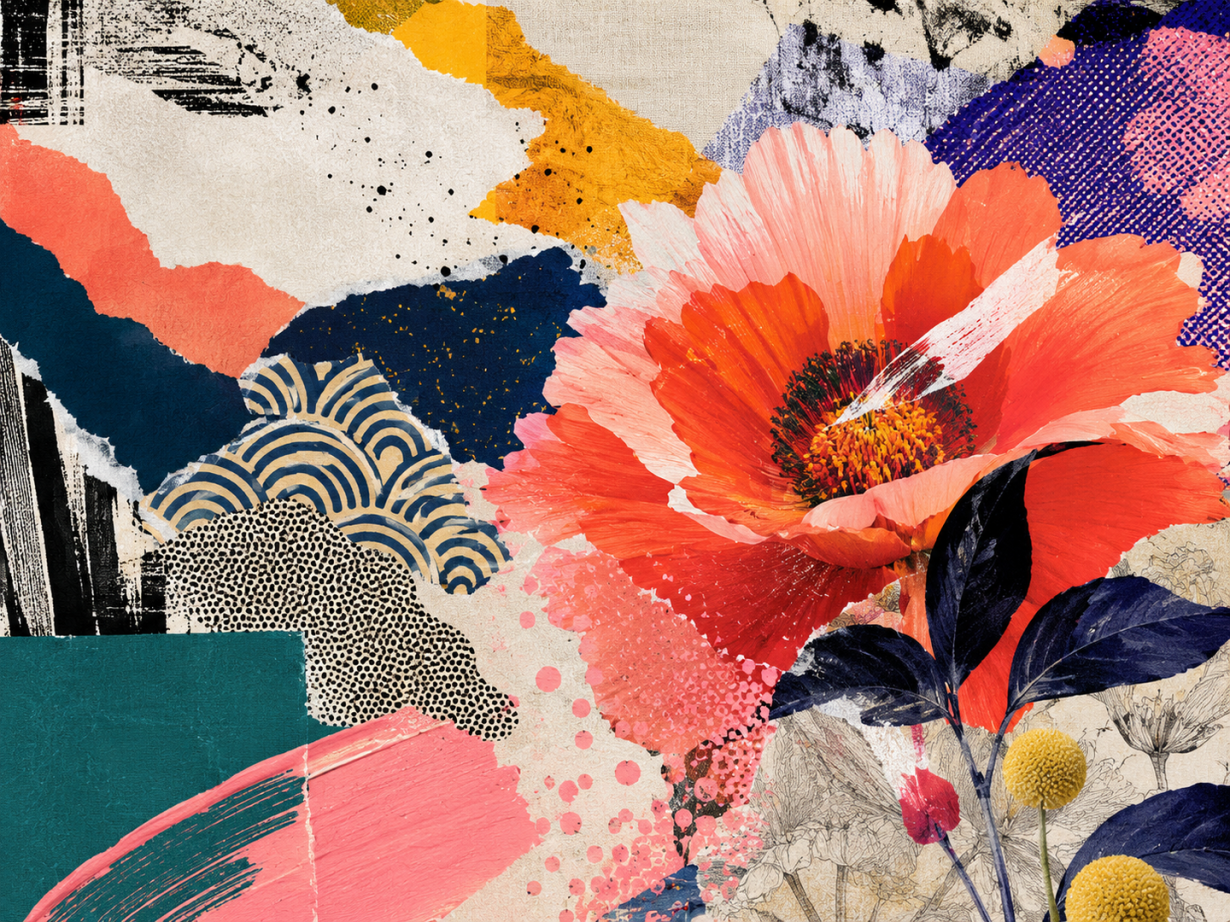
Maximalism looks easy until you try to make it work. You add a paper grain, then a floral pattern, then a second pattern, then a distressed type treatment, and suddenly the design has plenty of energy but no clear message.
That is the real challenge behind how to create maximalist textures: not making more marks, but making more marks behave. In graphic design, maximalist texture has to support hierarchy, not bury it. It has to add mood, rhythm, and tactility without turning the layout into a decorative fog.
The strongest maximalist graphic design in 2026 feels human, layered, and tactile, but it still has a spine. This guide shows you how to build that spine first, then add texture with control.
What Maximalist Texture Means in Graphic Design in 2026
Maximalist texture is not the same thing as visual clutter. Clutter happens when every surface asks for equal attention. Maximalist texture works when a design feels abundant but still tells the viewer where to look first, second, and third.
That distinction matters because 2026 design trends are pushing hard toward tactile, layered, human-looking work. Digital Synopsis' 2026 graphic design trend report points to visual density, expressive type, tactile effects, and maximalist energy as major creative directions. Creative Bloq describes a similar shift toward texture, warmth, and "anti-AI craft" as designers react against polished sameness.
For graphic designers, that shift creates an opportunity and a risk. The opportunity is obvious: texture can make a poster, packaging system, social graphic, or brand world feel alive. The risk is that texture becomes a shortcut for personality. A noisy background does not make a concept stronger. A distressed brush does not fix weak composition.
Think of maximalist texture like a crowded street market. The color, noise, signs, fabric, shadows, and movement create atmosphere, but you still need a path through it. In design terms, that path is hierarchy.
Once you treat texture as hierarchy support instead of decoration, the whole process becomes easier to control.
Build the Message Layer Before the Texture Layer
Before you open a brush library or build a seamless pattern, decide what the design needs to say from a distance. This is the message layer, and it should be boringly clear.
Ask four questions:
What is the first thing the viewer must understand?
What is the emotional tone: joyful, strange, luxurious, rebellious, nostalgic, handmade?
Which element owns the focal point: type, illustration, product, symbol, or image?
Where can texture add meaning instead of just filling space?
For example, a maximalist poster for an experimental jazz night might use scratchy ink, off-register type, torn paper edges, and dense pattern because the event itself is improvised and tactile. A skincare brand using the same treatment would probably feel confused unless the concept is about raw ingredients, ritual, or sensory contrast.
This is where many maximalist designs fail. Designers start with effect, then try to make the message fit later. Reddit critique threads around poster design repeat the same issue in different words: people can feel when a composition is busy, but they usually complain because hierarchy, legibility, or purpose broke first.
Set the message layer in plain form before texture enters:
Place the main type or focal image.
Establish one dominant alignment or movement direction.
Choose one primary contrast: scale, color, value, or shape.
Test the layout in black and white.
Shrink it to thumbnail size.
If the design cannot communicate before texture, texture will only hide the problem.
The Five-Layer Texture Stack: Grain, Pattern, Motif, Type, and Finish
A reliable way to create maximalist textures is to separate the texture system into layers. Each layer has a job. If two layers do the same job, one of them probably needs to go.
Layer 1: Base Grain
Base grain gives the surface atmosphere. It can be paper fiber, photocopy noise, halftone dust, canvas weave, scanned cardboard, soft blur, or subtle ink bleed.
Keep this layer low contrast. Base grain should be felt before it is noticed. If viewers notice the grain before they read the message, it is too strong.
Good uses:
Adding warmth to flat vector shapes.
Making digital artwork feel less sterile.
Unifying mismatched collage elements.
Softening hard edges in a dense composition.
Layer 2: Repeating Pattern
Repeating pattern creates rhythm. This might be floral, geometric, typographic, scribbled, ornamental, dotted, striped, or hand-drawn.
The mistake is making every pattern equally loud. Use scale to create order. One pattern can be large and slow. One can be medium and active. One can be tiny and textural. This large-medium-small relationship keeps maximalism readable.
For repeat construction, the most important production rule is edge continuity. If an element crosses the right edge of a tile, duplicate it at the same vertical position on the left edge. If it crosses the top, duplicate it at the same horizontal position on the bottom. Frankentoon Studio's Affinity Designer pattern guide is useful for understanding that tile logic in practice.
Layer 3: Anchor Motif
The anchor motif is the recognizable thing that stops texture from becoming wallpaper. It could be a flower, star, snake, mask, letterform, product silhouette, character, or abstract symbol.
Use one anchor motif family, not five unrelated ones. Variation is fine, but the viewer should feel a repeated idea. If every motif belongs to a different visual world, the composition starts to feel assembled instead of designed.
Layer 4: Type Texture
Typography can carry texture too: warped baselines, imperfect ink traps, inflated letters, hand-cut edges, outline stacks, shadow layers, and embedded pattern fills. But type texture has stricter rules because words still need to read.
Use texture differently across type levels:
Display headline: high texture allowed.
Subhead: moderate texture, strong contrast.
Body or detail text: minimal texture, high legibility.
Do not distress every line. A rough headline above clean supporting type often feels more maximalist than a fully distressed layout because the contrast gives the texture something to push against.
Layer 5: Finish
Finish is the final pass: overprint effect, risograph offset, foil simulation, paper shadow, scan line, blur, chromatic fringe, or transparent ink overlap.
Finish should connect the layers, not introduce a new concept. If the finish adds a new style direction, it is not finishing the design; it is restarting it.
This stack gives you abundance with roles: atmosphere, rhythm, recognition, voice, and cohesion.
How to Create Maximalist Textures Without Losing Readability
Readability is not the enemy of maximalism. It is what lets maximalism survive contact with real viewers.
The easiest rule is this: every maximalist design needs one quiet decision. It might be a limited palette, a strong grid, a clean type block, a flat color field, or a repeated shape. Something has to stay calm so everything else can move.
Use these controls when the composition starts feeling muddy.
Limit the Palette Before You Limit the Texture
A maximalist design can hold many textures if the palette is disciplined. Start with three to five core colors:
One dark anchor.
One light rest color.
Two expressive midtones.
One accent that appears sparingly.
Then let texture create variety inside those colors. This keeps the design rich without turning it into a color argument.
Separate Detail From Contrast
Detail and contrast are different tools. A pattern can be detailed but low contrast. A headline can be simple but high contrast. If every detailed area is also high contrast, the eye has nowhere to rest.
Try making background texture detailed but close in value. Then reserve sharp contrast for the focal point.
Build a Viewing Order
Maximalist texture needs a viewing order:
Focal point.
Supporting type or image.
Secondary motifs.
Background texture.
Small discoveries.
If the viewer discovers tiny details before understanding the main message, the order is wrong.
Use Negative Space as Pressure, Not Empty Space
Negative space does not need to be white, blank, or minimalist. In maximalist graphic design, negative space can be a quieter patch of grain, a flat shape, a low-contrast pattern, or a smooth color block.
The point is pressure control. Dense areas feel richer when they have calmer areas to press against.
These readability controls let you keep the expressive surface without losing the communication job underneath it.
Surface Pattern Workflow: From Tile to Full Composition
If your maximalist texture needs to become a surface pattern, start with a tile. A tile forces you to solve repetition, rhythm, and density before the pattern touches the final layout.
Use this workflow.
Step 1: Choose the Pattern Job
Decide whether the pattern is background atmosphere, brand language, focal illustration, packaging surface, or decorative trim. A background pattern should not behave like a focal illustration.
Step 2: Set Tile Size and Grid
Start with a square tile, such as 2000 x 2000 pixels or a matching vector artboard. Add guides at the center and edges. Do not fill the tile yet.
Step 3: Place the Anchor Motif First
Add the largest motif first. Keep it slightly off center unless symmetry is the concept. Then duplicate edge-crossing pieces to the opposite side so the repeat stays seamless.
Step 4: Add Medium Rhythm
Add secondary motifs that connect the large anchors. These might be leaves, ribbons, sparks, checker fragments, hand-drawn marks, or type snippets. Rotate and scale them, but keep them related.
Step 5: Add Micro Texture Last
Add grain, dots, scratches, or tiny fills after the main rhythm works. Micro texture is seasoning. If you use it to fix weak rhythm, the tile will become dense but still boring.
Step 6: Test the Repeat at Multiple Scales
Duplicate the tile into a 3 x 3 grid. Zoom out. Then shrink it to the size it will appear in the final design. Watch for accidental stripes, holes, tangents, or motifs that line up too perfectly.
Step 7: Place the Pattern Into the Composition
Once the repeat works, mask it into the final layout. Do not let the pattern decide the whole composition. The message layer still leads.
Envato Tuts+ has a practical maximalism pattern tutorial that is useful for seeing how motifs can be assembled into a fuller repeat. The important extra step is editing: make the pattern serve the graphic design goal, not just the repeat.
Editing Tests: When to Stop Adding Texture
The hardest part of maximalist design is stopping. Not because there is no room left, but because there is always room for one more interesting mark.
Use these tests before you call the work finished.
The Thumbnail Test
Shrink the design to the size it will appear in a feed, portfolio grid, or search preview. You should still understand the main message. If it turns into a decorative blur, simplify the background or strengthen the focal point.
The Squint Test
Squint at the design until small details disappear. You should see a clear value structure. If the whole piece becomes one middle-gray block, separate darks, lights, and midtones more clearly.
The One-Layer-Off Test
Turn off one texture layer at a time. If the design gets stronger when a layer disappears, that layer was not supporting the system. Delete it or reduce it.
The Role Test
Name the job of every layer:
This grain warms the surface.
This pattern creates rhythm.
This motif anchors the concept.
This type treatment carries the voice.
This finish unifies the print feel.
If you cannot name the job, the layer is probably decoration.
The Client-Sentence Test
Explain the design in one sentence without using style words. Not "it is maximalist and bold," but "it makes the festival feel handmade, loud, local, and full of movement." If you need the word maximalist to justify the work, the concept may not be strong enough yet.
That is the practical answer to how to create maximalist textures: build the message first, stack texture by role, protect hierarchy, and edit with discipline. The result can still be loud, lush, strange, tactile, and full of detail. It will also be readable, intentional, and useful.
Tags
Linh Nguyen
Graphic Designer
Passionate Graphic Designer | Specializing in Illustration Design | Bringing Captivating Visuals to Life