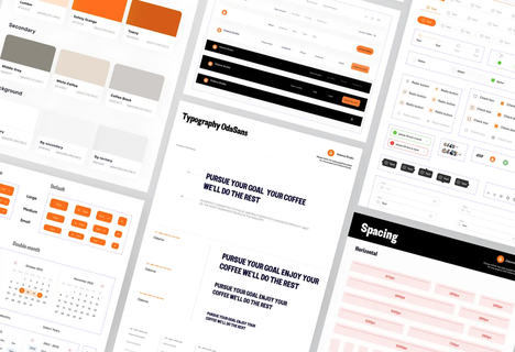
Design tips
UI Pattern Library vs Design System: The Decision Framework
A post on r/UXDesign recently exploded — thousands of upvotes, hundreds of comments — with a title that captured how a lot of designers feel: "I Hate Design Systems." The
Graphic Designer
Passionate Graphic Designer | Specializing in Illustration Design | Bringing Captivating Visuals to Life
A post on r/UXDesign recently exploded — thousands of upvotes, hundreds of comments — with a title that captured how a lot of designers feel: "I Hate Design Systems." The
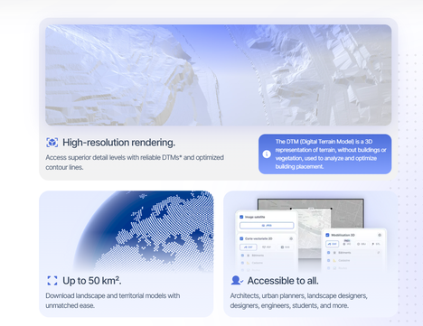
You've been there. Client sends over a gorgeous illustrated map as a JPEG. You need it as a clean, scalable SVG — for a print brochure, a web interface, a
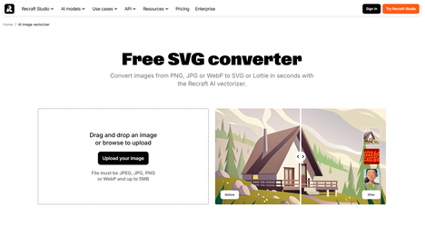
I spent three hours last week cleaning up an SVG that an AI generated in four seconds.The logo looked fine at 100% zoom. The curves seemed smooth. The colors were
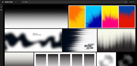
You open a design, apply the halftone filter, and the result looks — like a halftone filter. Dots in a gradient. Retro feel. Done.Except: the dots are fighting the type.
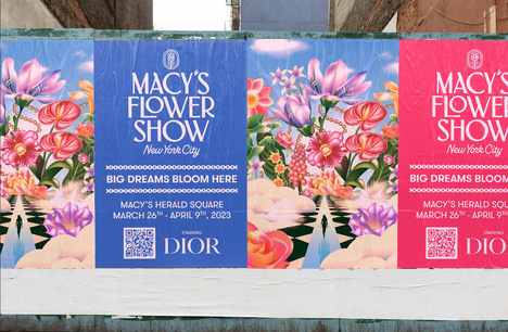
The worst thing that happens with Hyper-Bloom isn't that it looks bad. It's that it looks almost right — the florals are big enough, the blur is soft enough, the
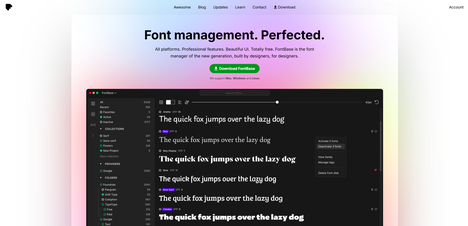
If your font folder looks like final-fonts-v3-really-final, you are already at the point where a font manager pays for itself. The best font manager helps you preview type faster, activate

If you've scrolled through Instagram, browsed a beauty brand's latest packaging, or walked past a hotel lobby in the last eighteen months, you've felt it before you could name it.
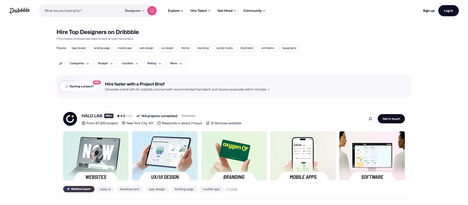
Hiring a graphic designer in 2026 isn't the same as it was five years ago. The tools have changed. The expectations have shifted. And yet, the same fundamental mistakes keep