Mood Board vs Brand Board vs Style Guide (2026)
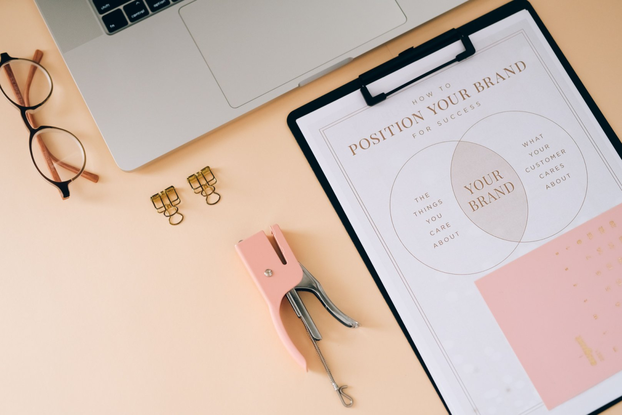
Clients use the three names interchangeably. Designers sometimes do too. Then a project stalls for a familiar reason: the client approved a mood board thinking they approved a logo, or received a style guide they read as suggestions instead of rules. Each artifact has one job. Mix the jobs and the project pays.
In the workflow proposed here, each artifact has a distinct role. A mood board explores feeling before the identity decision. A brand board locks the identity decision on one page. A style guide enforces the rules after the decision so handoffs stay consistent. This post defines what belongs on each, when each appears, and the minimum set a small team actually needs.
Mood board: explore before you commit
A mood board is a collage of images, type samples, colors, textures, and sometimes video that evokes a direction without specifying anything. Milanote's guide describes the modern form well: a collection of visual material that communicates vision for a project, built to align a team on feeling before anyone draws a mark. Nothing on a mood board is final. That is the point.
Build two or three boards per project, genuinely different from each other. One safe and familiar, one strange and distinctive, one borrowed from an adjacent domain. Present them as directions to react to, never as options to pick between, because clients confronted with three boards choose elements from each and ask for a blend that means nothing. Ask instead which board feels most like the future they want, and what specifically repels them about the others. Rejection teaches more than approval at this stage.
Keep mood boards visibly unfinished. Rough edges signal exploration and invite honest reaction. A mood board polished into a presentation deck reads as a decision, and clients approve it as one, which creates the classic failure: sign off on a feeling, then shock when the concrete identity that follows looks like work instead of vibes. Our brand identity guide starts where mood boards end, turning chosen feeling into named attributes the identity must express.
Digital boards beat PDFs because direction evolves. Shared boards collect comments, swap images in seconds, and keep remote teams in one place. Archive the rejected boards with notes on why they lost. Six months later, when someone suggests a direction the team already explored, the archive answers before the debate restarts.
Brand board: the identity on one page
A brand board shows the decided identity, all core elements composed on a single page: primary logo and approved variants, color palette with values, typography pairing, supporting patterns or textures, and two or three application mockups proving the elements work together. Where the mood board asked a question, the brand board states the answer.
The audience is different, so the content rules differ. Mood boards speak to designers and adventurous clients in the language of feeling. Brand boards speak to every stakeholder, including the ones who never attended a workshop, in the language of fact. Every element shown is final and approved. Nothing exploratory survives here. If an element is still debated, the board is premature.
One page forces the coherence test. Elements that looked fine in isolation clash in composition: a display face that fights the logo geometry, a palette where two colors never appear together in practice, a pattern that adds noise instead of character. Lay everything out together and these conflicts surface before launch instead of after. A brand board that looks calm means the system coheres. A brand board that looks busy is a diagnosis, not a deliverable.
Include usage intent, not just specimens. Show the logo at small size to prove legibility, the palette applied to a real layout instead of bare swatches, type set as headlines and body instead of alphabet samplers. Mockups do the persuading that spec sheets cannot. The vibe design piece argues the designer sets the aesthetic frame while the machine fills it; the brand board is that frame made visible and signed off.
Style guide: rules that survive handoff
A style guide turns the decided identity into enforceable rules for everyone who touches the brand after launch: developers, marketers, freelancers, AI tools. Logo clear space and minimum sizes, exact color values across print and screen, type scale with named styles, voice and tone basics, do and do not examples. If the brand board is the portrait, the style guide is the law.
Write rules as checkable statements. "Headlines always use the display face at semibold or above" beats "use typography with impact." Exact hex, RGB, and CMYK values beat swatch images. Minimum logo size in pixels beats "do not shrink too small." Every vague rule becomes a future argument. Our typography mistakes roundup catalogs the failures style guides exist to prevent: pair two failures with their rules and the guide teaches instead of lecturing.
Show violations, not just ideals. A do and do not pair per rule (stretched logo beside correct logo, low contrast pairing beside approved pairing) communicates faster than paragraphs. A violation example can make the boundary easier to discuss; test whether it helps your reviewers. Keep each pair visual and adjacent so the lesson lands in one glance.
Scale the guide to the team. A small startup might begin with a short guide covering logo, color, type, and voice. A franchise may need more detail for signage, packaging, and co-branding. Page count should follow the actual requirements. Bloat kills compliance: a guide nobody opens enforces nothing. Start with the rules that prevent the mistakes you actually see, and grow the document when new failures appear rather than speculating about failures that might.
Side by side: contents, audience, lifespan
Mood board | Brand board | Style guide | |
|---|---|---|---|
Job | Explore feeling | Lock decision | Enforce rules |
Contents | Images, textures, type samples, colors | Logo, palette, type, mockups | Specs, clear space, values, violations |
Audience | Design team, client vision holders | All stakeholders | Developers, marketers, future hires |
Lifespan | Dies at decision, archived for reference | Lives until rebrand | Living document, updated quarterly |
Sign off | Direction chosen | Identity approved | Rules adopted |
Timeline: when each appears in a project
Order matters because each artifact feeds the next. Mood boards open the project, presented after discovery and before any identity design. Two or three directions, one chosen feeling, attributes named from the winner. Timebox exploration according to the scope and approvals needed. A longer phase does not by itself prove the discovery was vague.
Brand boards close the design phase, presented when the identity is finished and approved as a whole. Never present a brand board element by element across weeks; piecemeal approval produces a Frankenstein system where each part was liked separately and nothing coheres. One reveal, one page, one decision.
Style guides ship with handoff, written as the identity gets built and delivered when others start using the brand. Writing the guide during production, not after, keeps rules honest: a rule authored while implementing is tested against reality, while a rule invented afterward describes an ideal nobody built. Budget guide writing into the production phase, not as an afterthought line item.
AI tools can generate identity drafts, but generation speed does not remove the need to explore, approve, and document a direction. Review the actual deliverables: a generated kit may include usage rules as well as visual assets, and both need human review.
Small team minimum viable set
Most small teams need less than agencies sell. One mood board direction with written attributes, not three boards and a workshop report. One brand board page with logo, color, type, and two mockups, not a forty slide deck. For example, a short style guide covering the four systems plus violations, not a brand bible.
Name one owner for the set. Boards without owners rot: the guide goes stale after the first rebrand fragment, the brand board stops matching production, and the next hire invents their own palette. Ownership means quarterly review against actual output, updating rules when practice changes, and the authority to reject off brand work kindly. A living ten page guide beats a dead hundred page one every time.
Start the next project by naming which artifact each meeting serves. Exploration meeting, decision meeting, enforcement check. When everyone knows which job the current artifact does, approvals mean what they say, and the brand survives contact with reality.
Linh Nguyen
Graphic Designer
Passionate Graphic Designer | Specializing in Illustration Design | Bringing Captivating Visuals to Life