High-Contrast Serifs: When Sharp Contrast Works and When It Fails
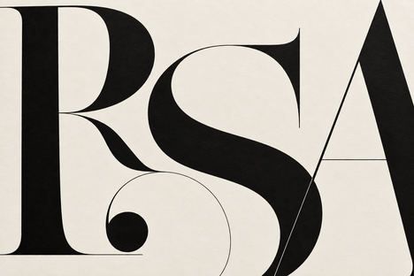
High-contrast serifs work best when their thin strokes remain visible and their strong shapes suit the job. A short editorial headline can give them room to shine. A small label

A lower third can look fine in the first approval round. Problems can emerge on later revisions: a guest has a 42-character job title, the brand color changes, the video
In August 2026, an artist-focused social and portfolio platform got scraped three times that month. Cara reported the attacks on its own blog: starting August 13th, three scrapes took 12M
Social campaigns often look inconsistent for a simple reason: teams reuse files, but they do not reuse decisions. One launch gets a fast type reveal, the next uses a floating
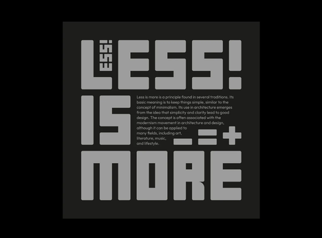
You can choose a beautiful typeface, build a clever grid, and still end up with a poster that makes people work too hard. The problem is rarely that the headline
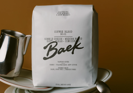
The fastest way to make a design feel personal is also one of the easiest ways to make it look unfinished: pick a handwriting font because the preview looks charming,
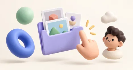
Start with 3dicons for object icons, HANDZ for hand gestures, Shapefest for abstract shapes, Icons8 for characters, and IconScout for a changing selection of free assets. Each offers a useful
A handwriting font can make a restaurant menu feel warm before anyone reads the first dish. It can suggest a baker's hand, a chef's note, a chalkboard special, or the